A blockbuster exhibition’s narrative isn’t told; it’s architected. The curator’s primary role is not that of a storyteller, but of a narrative architect who designs a multi-sensory journey for the visitor.
- The emotional impact of a show is sculpted by technical elements like lighting and pacing, which function as a form of narrative punctuation.
- Layout choices (chronological vs. thematic) are fundamental structural decisions that define how visitors build understanding and make connections.
Recommendation: Shift your focus from merely selecting objects to strategically choreographing the visitor’s attention, emotion, and intellectual engagement through every design choice.
Many assume a curator’s job is to select beautiful or important objects and arrange them in a room. The common advice is to “tell a story,” a platitude that vastly underestimates the complexity of the task. While a compelling narrative is essential, it is merely the surface layer. For museum professionals and students of the craft, the real work lies in understanding that a blockbuster exhibition is not a storybook but a meticulously constructed environment. It’s an architecture of experience, where every element is a load-bearing wall supporting the visitor’s journey.
The true challenge is to move beyond simple storytelling and become a narrative architect. This involves orchestrating a complex interplay of space, light, text, and rhythm. We must consider how the viewer’s eye travels, how their energy wanes, and how their understanding is built piece by piece. The goal is to create a powerful emotional arc and provide the intellectual scaffolding necessary for meaning to emerge, catering to both the seasoned art historian and the curious novice simultaneously. This is the strategic core of modern curation.
This article deconstructs the key decisions a curator makes to build that narrative architecture. We will explore the structural choices—from the dramatic power of lighting to the subtle psychology of pacing—that transform a collection of objects into an unforgettable blockbuster experience. We will dissect the tactical elements that guide, challenge, and ultimately reward the visitor, revealing how a great exhibition is designed not just to be seen, but to be felt and understood on a profound level.
Summary: The Blueprint of an Exhibition Narrative
- Why Does Lighting Design Make or Break the Viewer’s Emotional Arc?
- Thematic or Chronological: Which Layout Engaging Audiences More?
- How to Write Wall Text That Educates Experts and Novices Alike?
- The Bias Trap That Can Skew the Historical Accuracy of a Show
- How Long Does It Take to Secure Loans for a Major International Show?
- The Display Error That Strips Sacred Objects of Their Meaning
- The Pacing Error That Makes You Hate the Last Room of a Large Show
- How to Prepare for a Retrospective Exhibition to Get the Full Insight?
Why Does Lighting Design Make or Break the Viewer’s Emotional Arc?
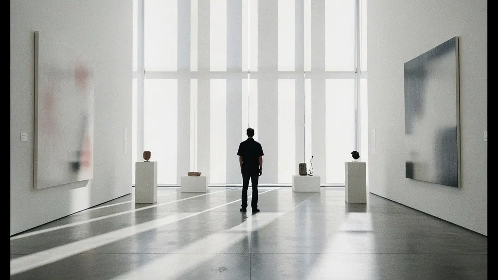
Lighting is the unsung hero of narrative architecture in a museum. It is far more than mere illumination; it is the primary tool for sculpting the visitor’s emotional journey. By creating a carefully planned choreography of attention, lighting directs the eye, establishes mood, and dictates the rhythm of the experience. A shift from a dimly lit, intimate space to a brightly illuminated, expansive gallery is not just a change in brightness—it’s a form of narrative punctuation. It can signify a new chapter, a climax, or a moment of quiet reflection, guiding the visitor’s emotional response without a single word.
The strategic use of light creates patterns of compression and release. A focused spotlight on a single object in a dark room creates a moment of intense, almost reverential focus. Conversely, broad, even lighting encourages comparison and dialogue between multiple works. The temperature of the light also plays a role; warm tones can evoke intimacy and nostalgia, while cool tones suggest clinical analysis or a more somber theme. These are not aesthetic afterthoughts; they are foundational decisions that build the viewer’s emotional arc from the moment they enter until they leave.
Case Study: Matisse’s Cut-Outs and Strategic Lighting
The Tate Modern’s 2014 exhibition, *Henri Matisse: The Cut-Outs*, became the museum’s most successful show, in large part due to its lighting strategy. The curators used light to amplify the incredible vibrancy of the paper cut-outs. As visitors moved through the spaces, the lighting design shifted to match the evolving energy of Matisse’s work, creating a dynamic journey that mirrored the artist’s own creative explosion in his later years. This proves how strategic lighting directly influences visitor emotion and engagement, turning a viewing into an experience.
Action Plan: Implementing Narrative Lighting Techniques
- Design compression and release patterns by planning dramatic dark-to-bright transitions between gallery sections to reset visitor focus.
- Map out variable color temperatures to signal thematic shifts; for instance, use warm light for personal stories and cool light for historical context.
- Identify key artworks to serve as ‘spotlight moments,’ using focused beams to create visual punctuation and anchor the narrative.
- Program gradual lighting changes within a single space to subtly guide the visitor’s pace and draw attention to specific details over time.
- Use directional lighting to create clear visual pathways, connecting related artworks and reinforcing the curator’s intended narrative flow.
Thematic or Chronological: Which Layout Engaging Audiences More?
The choice between a chronological and a thematic layout is perhaps the most fundamental structural decision in narrative architecture. It’s the blueprint upon which the entire visitor experience is built. A chronological layout offers clarity and a straightforward narrative of progression, making it ideal for retrospectives or historical surveys. It allows visitors to follow an artist’s development or a movement’s evolution in a linear, easy-to-digest fashion. However, its predictability can sometimes lead to visitor fatigue, as the rhythm becomes monotonous.
A thematic layout, by contrast, shatters the timeline to create new, often surprising, conversations between objects from different eras. This approach encourages active interpretation, asking the visitor to make connections based on concept, form, or material rather than date. It is exceptionally powerful for contemporary art or conceptual shows, where the idea is more important than the timeline. A non-linear, immersive approach can create blockbuster results; for example, data shows that 160,000 visitors viewed the Hirshhorn Museum’s immersive, thematically arranged Yayoi Kusama exhibition, making it a historic success for the institution.
Increasingly, we see hybrid models that blend both approaches—a “chrono-thematic” structure. This might involve a main chronological path with thematic alcoves branching off, allowing visitors to dive deeper into specific concepts before returning to the timeline. This offers the best of both worlds: the clarity of a timeline and the intellectual stimulation of thematic juxtapositions.
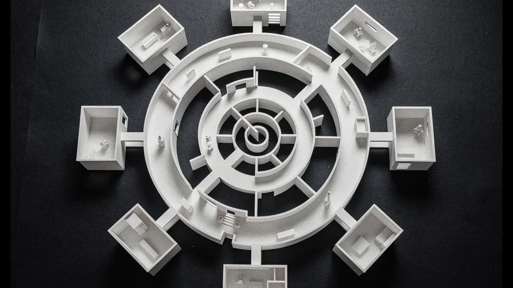
The most sophisticated narrative architectures often go beyond a simple binary choice. As the model above suggests, a layout can be designed as a spiral, where the main path suggests a chronological flow, but adjacent chambers allow for deep, thematic explorations that enrich the central story. This provides both a clear path and opportunities for discovery, catering to different modes of engagement.
This comparative table breaks down the core trade-offs of each approach, a critical consideration that, according to a recent analysis of epic exhibition storytelling, sits at the heart of curatorial strategy.
| Aspect | Chronological Layout | Thematic Layout |
|---|---|---|
| Narrative Clarity | Linear progression, easy to follow | Complex connections, requires active interpretation |
| Educational Impact | Strong for historical context | Effective for conceptual understanding |
| Visitor Fatigue | Predictable pacing can cause monotony | Variety maintains engagement |
| Flexibility | Limited ability to create surprises | Allows for dramatic juxtapositions |
| Best For | Retrospectives, historical surveys | Contemporary art, conceptual exhibitions |
How to Write Wall Text That Educates Experts and Novices Alike?
Wall text is the voice of the exhibition, the primary form of direct communication with the visitor. Poorly executed, it can feel like a dense, uninspired textbook on a wall. Done well, it functions as intellectual scaffolding, providing just enough support for visitors to build their own understanding. The central challenge is a paradox: the text must be accessible enough for a complete novice while remaining insightful enough not to bore an expert. It must educate without patronizing and inform without overwhelming.
The most effective strategy is a multi-layered or tiered approach to information. This acknowledges that visitors have different needs and levels of engagement. Some want a quick takeaway, others want a deep dive. By structuring text in layers, we empower visitors to choose their own depth of engagement, a practice that significantly enhances their experience. This transforms passive reading into an active process of inquiry.
The Three-Tier Labeling System
An increasingly common and successful strategy is the three-tier system. The first tier is the “hook”—a short, engaging sentence or question that grabs attention and presents the core idea of the artwork. The second tier is the “core paragraph,” typically 50-70 words, which provides essential context and interpretation. The final tier is the “expert detail,” a smaller block of text offering more specialized information, such as technical details, art historical context, or direct quotes. Research from museums that implement this strategy shows that visitors spend more time with artworks because they feel in control of their learning, self-selecting the information they desire.
Ultimately, the tone of the text is as important as its content. It should be invitational, not dictatorial. Instead of telling visitors what to think, the best wall text poses questions and opens doors, encouraging them to look closer and form their own conclusions. It acts as a bridge between the object and the viewer, facilitating a conversation rather than delivering a lecture. This approach respects the intelligence of every visitor, regardless of their background.
The Bias Trap That Can Skew the Historical Accuracy of a Show
Every exhibition is an argument. The very act of selecting certain objects and omitting others, of placing them in a particular sequence, is a powerful editorial statement. As curators, we must be acutely aware of our own biases—whether institutional, cultural, or personal—as they inevitably shape the narrative we present. The greatest trap is to present a single, authoritative perspective as “the” history, when in fact it is “a” history. This is where the narrative architect carries a profound ethical responsibility.
Exhibitions materially express a discursive stance. That is, they express ‘reality’ from a particular perspective and have particular interests at their core.
– Tiina Roppola, Narrative Theories and Learning in Contemporary Art Museums
To build a more honest and historically accurate narrative, the solution is not to pretend to be without bias, but to actively embrace multiplicity. This means intentionally including conflicting perspectives, highlighting gaps in the historical record, and giving voice to marginalized or forgotten histories. For example, instead of displaying a colonial artifact solely as an object of aesthetic beauty, we can pair it with contemporary responses from the culture of its origin. This creates a richer, more complex, and more truthful narrative.
Actively addressing contested histories is a powerful curatorial tool. Instead of shying away from controversy, an exhibition can become a forum for dialogue. According to research on contested museum narratives, the Imperial War Museum’s Northern Ireland exhibition successfully used 5 different videos to present conflicting viewpoints, demonstrating a commitment to showing how multiple, competing truths can coexist. This approach doesn’t weaken the narrative; it strengthens it by transforming the museum from a temple of facts into a forum for critical thinking.
How Long Does It Take to Secure Loans for a Major International Show?
Behind every blockbuster exhibition is a mountain of logistical and diplomatic work that is invisible to the public. The process of securing loans for major international shows is the painstaking, multi-year foundation upon which the narrative is built. You can have the most brilliant curatorial concept in the world, but without the key objects, the story cannot be told. This process is a high-stakes negotiation involving delicate relationships, complex legal agreements, and immense financial investment.
The timeline is often shockingly long. For a show featuring significant works from multiple international institutions, the process begins three to five years before the opening date. This involves identifying key works, formally requesting loans from other museums or private collectors, and navigating the complex approval processes of each lending institution. According to industry analysis, blockbuster exhibitions can take years to organize, with costs for insurance, shipping, and courier fees often exceeding $1 million. Each loan is a self-contained project requiring meticulous attention to detail.
Furthermore, this process is fraught with uncertainty. A change in a lending institution’s leadership, a shift in political climate, or a global crisis can derail years of planning. Curators must therefore build redundancy into their plans, identifying backup objects for every key piece in the narrative. This diplomatic dance requires not just art historical expertise, but also patience, persistence, and a talent for building and maintaining trust with colleagues around the world.
Case Study: The Uncertainty of Global Loans
The Gropius Bau’s planned Yayoi Kusama retrospective highlighted the fragility of international loans. The exhibition team faced significant hurdles as lenders in Japan and the United States grew increasingly insecure about letting major works travel during a period of global uncertainty. This required extensive diplomatic negotiations, constant reassurance, and the development of backup plans for nearly every single key artwork. It’s a stark reminder that an exhibition’s narrative is always at the mercy of real-world logistics and relationships.
The Display Error That Strips Sacred Objects of Their Meaning
When curating objects that hold sacred or ritual significance, the narrative architect faces a unique and profound responsibility. A common and devastating error is to treat these items purely as aesthetic objects, stripping them of their cultural context and spiritual power. Displaying a ceremonial mask flat on a wall or a sacred vessel in a sterile glass box, lit for its formal beauty alone, can be an act of profound disrespect. It privileges a Western, aesthetic-focused viewpoint and silences the object’s original purpose and meaning.
The curatorial act of selection and display is an authoritative one. It confers a specific kind of significance onto an object, often one that was never intended. The key to avoiding this display error is to move from a position of authority to one of collaboration. This means engaging in deep consultation with source communities before any display decisions are made. These communities are the true experts on the object’s meaning, its proper orientation, and the context required for it to be understood respectfully.
To restore an object’s meaning, we must attempt to recreate its sensory context. This goes far beyond a simple wall label. It might involve:
- Conducting deep consultation with source communities to guide all display decisions.
- Recreating appropriate sensory contexts, such as specific soundscapes or lighting conditions that mimic its original environment.
- Ensuring the object is positioned and oriented according to strict cultural protocols.
- Integrating multi-sensory elements to evoke the object’s ritual or spiritual dimensions, where appropriate and permitted.
- Providing rich contextual information, gathered from source communities, about the object’s original use, social function, and spiritual significance.
This approach shifts the goal from simply “displaying” an object to creating an environment where its true significance can be respectfully communicated. It’s about honoring the object not as a static artifact, but as a living piece of cultural heritage.
The Pacing Error That Makes You Hate the Last Room of a Large Show
Every curator has witnessed it: the dreaded “gallery fatigue.” Visitors who were engaged and curious in the first few rooms are, by the end, shuffling past masterpieces with a glazed look in their eyes. This isn’t their fault; it’s a failure of narrative architecture. Pacing is the strategic management of a visitor’s energy and attention over time. A common error is to maintain a constant level of intensity, overwhelming the visitor with a relentless succession of major works. Without moments of rest and reflection, the mind simply shuts down.
The solution lies in thinking like a composer. A great exhibition should have a rhythm, with crescendos, quiet passages, and moments of surprise. This means intentionally designing “palette cleanser” rooms or corridors. These are spaces with lower-density displays, different lighting, or even comfortable seating, designed to give the visitor a mental break. According to research on visitor experience, exhibitions that place these ‘palette cleanser’ rooms about two-thirds of the way through the journey see a significant reduction in decision fatigue and a marked increase in engagement in the final galleries.
The “Crescendo and Coda” Structure
Successful exhibitions often employ a structure borrowed from music. The penultimate room is designed as the narrative climax or “crescendo,” featuring the most dramatic or significant works of the show. This is immediately followed by a final, quieter “coda” room. This space is typically less dense and more reflective, allowing visitors to process what they have seen and conclude their journey on a contemplative note. Museums using this structure report higher visitor satisfaction scores and increased dwell time in the final gallery, transforming what is often the weakest point of the visitor journey into one of its most memorable.
This deliberate choreography of energy ensures that visitors arrive in the final room with the mental and emotional capacity to appreciate it. Instead of ending with exhaustion, the exhibition concludes with a sense of satisfying closure, leaving a lasting and positive impression. It’s the final, crucial element in a well-architected narrative journey.
Key Takeaways
- Curatorial work is narrative architecture, focusing on designing the visitor’s entire emotional and intellectual journey.
- Technical choices like lighting and layout are not decorative but are fundamental structural elements of the narrative.
- The ultimate goal is to create a dynamic, multi-layered experience that respects the visitor’s intelligence and energy, leading to a more profound understanding of the art.
How to Prepare for a Retrospective Exhibition to Get the Full Insight?
As narrative architects, our work finds its ultimate meaning in the experience of the engaged visitor. A well-designed exhibition is a complex text, and like any text, it can be read on multiple levels. For those who wish to move beyond a casual stroll and truly appreciate the curatorial argument of a retrospective, a strategic approach can unlock a much deeper understanding. It allows one to see not just the art, but the very architecture of the narrative we have built.
The first step is to prime your mind. Before even setting foot in the gallery, read the main curatorial essay in the catalogue. This is the curator’s thesis statement; it provides the central argument and the intellectual framework for the entire show. Understanding this argument beforehand transforms your visit from a passive viewing into an active search for evidence, connections, and counterpoints. You begin to see the “why” behind each placement and juxtaposition.
Once inside, consider defying the prescribed path. A powerful technique is to start your visit in the final room. By seeing the artist’s late work first—their ultimate vision—and then working backward, you can trace the origins of their ideas and recognize nascent themes in their early work that you might otherwise have missed. Pay special attention to the transitional works, the pieces that bridge major periods in an artist’s career. These are often where the most significant evolution and risk-taking occur. This method allows you to deconstruct the narrative, much like an architect studying a building’s blueprints.
Ultimately, a great exhibition is a dialogue. It is our carefully constructed argument, presented for you to explore, question, and make your own. By engaging with it actively, you complete the circle and bring the narrative architecture to life.
To fully grasp these concepts, the next logical step is to apply them. Visit an exhibition not just to see the art, but to analyze its construction. Identify the narrative arc, question the layout, and observe how the lighting makes you feel. Begin your journey to see the architecture behind the art.