True media literacy isn’t about spotting technical flaws; it’s about understanding the timeless ‘visual grammar’ used to direct your emotions and beliefs.
- Power has always used the same visual codes, from Egyptian reliefs to modern political ads.
- What you see online is often composed for algorithms, not just for the human eye.
Recommendation: Start by analyzing one image for 20 minutes using the formal analysis framework to reclaim your critical eye.
In the relentless flood of digital images, the advice to “be more critical” feels both essential and hopelessly vague. We are told to check sources and look for obvious digital alterations, but this barely scratches the surface. This approach treats visual manipulation as a modern problem of technology, a game of spotting Photoshop errors. It overlooks the fact that manipulating perception through images is a craft as old as art itself, with a sophisticated and enduring set of rules.
What if the most potent defense against 21st-century disinformation wasn’t a new software, but a 500-year-old skillset? Art history is not a passive appreciation of the past; it is an active discipline of deconstruction. It provides a powerful framework for understanding the visual grammar—the underlying system of composition, color, and symbolism—that creators have always used to tell specific stories and evoke precise emotions. The same tools used to analyze a Renaissance painting can be applied to a political ad, a viral meme, or an influencer’s selfie.
This is not about becoming an art expert. It’s about borrowing their analytical toolkit to develop genuine visual literacy. By understanding the historical continuity of visual persuasion, you move from being a passive consumer of images to an active, critical decoder. This guide will translate core principles from art history into a practical method for navigating the modern media landscape. We will explore how composition dictates virality, how power projects its image, how self-representation has evolved, and how the meaning of symbols can be a cultural minefield.
This article provides a structured approach to sharpening your analytical skills. By examining the fundamental principles that govern how images are constructed and interpreted, you can build a robust defense against visual manipulation. The following sections break down key concepts, connecting historical art theory to the immediate challenges of our digital world.
Summary: A Practical Guide to Visual Decoding
- Why Do Certain Composition Rules Make Images Go Viral Today?
- Political Poster or Oil Painting: How Power Projects Itself Visually?
- Self-Portraiture vs. Selfies: What Has Changed in Self-Representation?
- The Risk of Misinterpreting Symbols in a Globalized Visual World
- How to Use Color Theory to Influence Perception of Your Personal Brand?
- Why Did Cubists Reject the Single Perspective Used for 500 Years?
- White for Mourning: How Color Meanings Change Across Cultures?
- Why Engaging With Art for 20 Minutes a Day Boosts Problem-Solving Skills?
Why Do Certain Composition Rules Make Images Go Viral Today?
An image’s journey to virality often feels chaotic and unpredictable, yet it is frequently guided by a hidden logic. We are no longer just composing images for the human eye; we are also creating for an algorithmic audience. This phenomenon, algorithmic composition, rewards specific visual traits that social media platforms are programmed to identify and promote. These platforms prioritize content that generates “meaningful interactions,” a metric that is heavily influenced by an image’s ability to create immediate emotional resonance and clarity.
Interestingly, the rules for pleasing an algorithm bear a striking resemblance to classical art principles designed to capture and hold human attention. A strong central focus, clear subject matter, and high emotional impact have been staples of effective visual art for centuries. Today, these same elements are crucial because they are easily identifiable by AI recognition systems, which then boost their visibility. The infamous “3-second rule” of social media, where a user’s attention must be grabbed almost instantly, forces creators to rely on the same bold, unambiguous compositional structures that artists once used to command a viewer’s gaze across a crowded church or salon.
To succeed in this environment, a creator must master a new kind of visual grammar, one that speaks to both human psychology and machine learning. Here are key techniques that thrive under algorithmic review:
- Create content with high emotional resonance: Algorithms prioritize posts that generate comments and shares over simple likes, favoring images that provoke strong feelings.
- Use central focus compositions with clear subjects: AI recognition systems can better identify and categorize simple, bold subjects, increasing the chances of the image being shown to relevant audiences.
- Incorporate trending visual elements: Algorithms on platforms like TikTok heavily reward content that uses current audio and visual trends, creating a powerful incentive for rapid adaptation.
- Apply the 3-second rule: Optimize for immediate visual impact with clear, compelling imagery, as users scroll through feeds at high speed.
- Leverage semantic distinctiveness: Images with unique, memorable features that stand out from the visual noise are more likely to be shared and remembered, a factor that neural network analyses of engagement confirm.
Ultimately, understanding virality requires a dual perspective. We must see images not just as art or information, but as strategic assets designed to navigate a complex ecosystem of human attention and algorithmic judgment. By recognizing the patterns of algorithmic composition, we can begin to see the hidden structures that determine which images we see and which remain invisible.
Political Poster or Oil Painting: How Power Projects Itself Visually?
The visual language of power is one of history’s most consistent and enduring dialects. As the artist Diego Rivera once noted, “Great protests are great art works,” highlighting the deep-seated connection between visual expression and political assertion. From the divine right of kings to the authority of a modern state, leaders have always understood that power is not just held; it must be performed, projected, and seen. The tools for this performance—gaze, posture, scale, and symbolism—form a visual grammar that has remained remarkably stable across centuries and mediums.
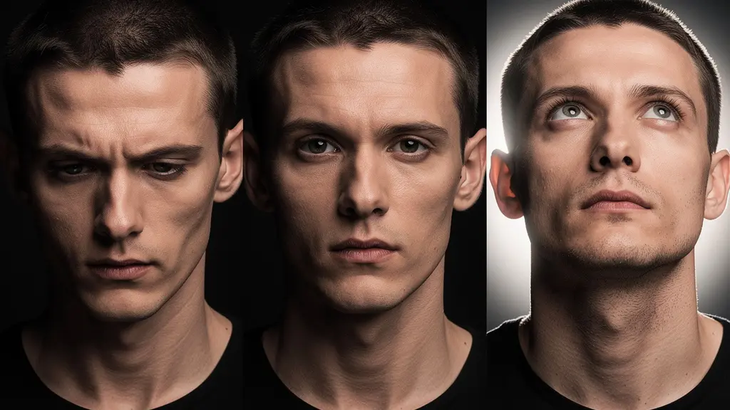
The gaze, for instance, is a primary tool. A subject looking down on the viewer asserts dominance and authority. A direct, confrontational gaze challenges the viewer and demands engagement. An upward or distant gaze suggests vision, destiny, and a connection to higher ideals. These are not arbitrary artistic choices; they are calculated components of a message designed to position the subject within a hierarchy of power. The lighting, angle, and composition all work in concert to reinforce this message, whether in an oil painting of a monarch or a carefully crafted photograph of a CEO.
Case Study: From Ancient Egypt to Modern Political Art
The continuity of power’s visual grammar is striking when viewed through history. As detailed in analyses of art and politics as expressions of power, the Assyrian Empire in the 9th-7th centuries BCE commissioned elaborate palace reliefs depicting military victories specifically to intimidate enemies and project invincibility. This is functionally identical to the Roman Triumphal Arches that celebrated imperial glory. In the 20th century, Soviet Socialist Realism employed heroic poses and upward gazes to depict the worker as the engine of a glorious future, while Nazi Germany used grandiose architecture to evoke a sense of overwhelming, permanent power. In our time, the same principles are at play, from the visionary upward gaze in Shepard Fairey’s iconic Obama “Hope” poster to the grassroots projection art used to mobilize voters.
Recognizing this unchanging grammar is the first step toward immunizing oneself against its influence. When you see an image of a political leader, ask yourself: Where are they looking? From what angle are we viewing them? What symbols surround them? By deconstructing the image using these art historical questions, you can separate the intended emotional effect from the objective reality of the subject.
Self-Portraiture vs. Selfies: What Has Changed in Self-Representation?
The act of representing oneself is not new, but its modern incarnation—the selfie—has fundamentally altered its meaning and function. Historically, a self-portrait was a considered act of representation. It was an artist’s attempt to fix an identity, to present a represented self to the world as a finished statement. It involved deep contemplation of personality, status, and mortality, from Rembrandt’s unflinching studies of aging to Frida Kahlo’s explorations of pain and identity. A self-portrait was a monologue.
The selfie, by contrast, is a dialogue. It is a single data point in a continuous, performative stream of a curated self. It is not meant to be a definitive statement but a fleeting update, designed for immediate reaction and engagement within a social network. The goal is not primarily introspection but communication and social validation. This shift from representation to curation changes everything. While a painter controlled every element on the canvas, the modern selfie-taker contends with algorithms, social pressures, and digital alteration tools that co-author the final image.
This has given rise to a new form of critical analysis: a digital connoisseurship. Just as an art historian learns to spot the brushstrokes of a particular artist or the signs of a forgery, a visually literate citizen can learn to identify the subtle traces of digital manipulation in self-representation. These are not just “beauty filters”; they are ideological tools that promote a narrow, often unattainable standard of appearance.
- Check for background warping: Look for distortions or strange curves in the background near body contours, a tell-tale sign of slimming or shaping apps.
- Look for uniform skin texture: An unnatural lack of pores, blemishes, or variations in skin tone is a clear indicator of heavy-handed beauty filters.
- Identify specific color grading patterns: Many preset filters leave a recognizable color signature or “look” that can be identified with a trained eye.
- Use reverse image search: Tools like TinEye can sometimes find original, unedited versions of an image that has been widely circulated.
- Analyze metadata: For the more technically inclined, viewers like Jeffrey’s Image Metadata Viewer can sometimes reveal a file’s editing history and the software used.
By learning to spot these interventions, we are not just “calling out fakes.” We are deconstructing the performance of the curated self and recognizing the powerful commercial and social forces that shape how we present ourselves online.
The Risk of Misinterpreting Symbols in a Globalized Visual World
In our interconnected world, images and symbols travel across borders at the speed of light. However, their meanings do not. A symbol’s significance is not inherent; it is culturally assigned. This creates a significant risk of iconographic drift, where a symbol’s meaning changes, sometimes dramatically, as it moves from one cultural context to another. What is a sign of purity in one culture can be a symbol of death in another. This is not a trivial matter; it has profound implications for communication, marketing, and diplomacy.
The corporate world is littered with expensive examples of this phenomenon. A marketing campaign that works brilliantly in one country can fail spectacularly in another due to a simple misunderstanding of color symbolism. The stakes are incredibly high, as research on cross-cultural marketing indicates that over 60% of consumer rejection of a product can be based on color alone. This demonstrates that visual grammar is not a universal language but a collection of distinct, culturally specific dialects.
Case Study: Color Symbolism Disasters in Global Marketing
Several high-profile cases illustrate the dangers of ignoring cultural context. When Euro Disney first launched, its extensive use of purple in marketing materials was intended to convey a sense of royalty and magic. However, in Catholic European countries, purple is strongly associated with death and crucifixion, creating a deeply unsettling association for the theme park. The campaign had to be completely redesigned. Similarly, many Western brands have stumbled by using white in campaigns targeting Eastern markets, where the color is traditionally associated with mourning, not weddings and purity. In response, savvy global brands like Coca-Cola and McDonald’s now meticulously adapt their color schemes by country. McDonald’s in India, for example, emphasizes warm, family-oriented colors while deliberately downplaying the beef-red tones prominent in its Western branding.
As citizens of a globalized visual culture, we must cultivate an awareness of this iconographic drift. When encountering a symbol in an unfamiliar context, the most important skill is to resist the urge to apply our own cultural interpretation. Instead, we must ask: What does this symbol mean to the culture that produced it? This act of critical humility is essential for accurate understanding and respectful communication. It is the art historian’s fundamental practice of considering provenance and context, applied to the everyday flow of global information.
How to Use Color Theory to Influence Perception of Your Personal Brand?
Color theory is more than an abstract artistic concept; it is a practical tool for psychological influence. In the realm of personal branding, color is not a decorative choice but a strategic one. The colors you associate with your name, your profile, or your content actively shape how you are perceived. They communicate values, evoke emotions, and position you within a specific social or professional context. Understanding this allows you to move from an accidental to an intentional use of color in constructing your public persona.
This strategic use of color must also be platform-specific. The visual grammar and user expectations of LinkedIn are vastly different from those of TikTok. Each platform has its own dominant color palette and visual rhythm. Aligning your personal brand with a platform’s existing color psychology can build subconscious trust and relevance, while deliberately contrasting with it can create a powerful, attention-grabbing effect. Your choice of color becomes a key part of your participation in that platform’s unique culture.

For anyone building a personal brand, a basic understanding of platform-specific color psychology is no longer optional. It’s about speaking the native visual language of the space you want to occupy. Here’s a quick guide:
- Facebook: The dominant blue palette is designed to build feelings of trust and dependability. Using similar blue tones in your branding can help you align with this core message of reliability.
- LinkedIn: The professional environment is reflected in its palette of blues and grays. Employing these colors suggests seriousness, competence, and corporate alignment.
- TikTok: This platform is characterized by high energy and urgency. Leveraging high-contrast combinations and neon accents can help your content match the platform’s fast-paced, attention-grabbing nature.
- Instagram: Traditionally a platform for vibrant, aspirational imagery, it often rewards warm, saturated tones. Using colors associated with sunsets, travel, and lifestyle can align with user expectations.
- Understand RGB vs. CMYK: A crucial technical point is that colors on a screen (RGB, or Red-Green-Blue) are created with additive light and thus appear more luminous than colors on a printed page (CMYK), which are subtractive. What looks vibrant on your profile may look dull in print.
By consciously selecting and deploying a color palette, you are engaging in a sophisticated form of non-verbal communication. You are telling your audience who you are, what you value, and where you belong before they read a single word.
Why Did Cubists Reject the Single Perspective Used for 500 Years?
For nearly five hundred years, Western art was dominated by a single, powerful idea: linear perspective. This system, perfected during the Renaissance, created a convincing illusion of three-dimensional space on a two-dimensional surface. But it did more than that; it presented a specific ideology. It proposed that there was one correct, fixed viewpoint from which to see the world. It was a visual metaphor for a stable, ordered, and singular truth. The Cubist revolution, led by Picasso and Braque, was a radical rejection of this entire worldview.
Cubism argued that truth is not singular but multifaceted. To truly represent an object, one must show it from all possible viewpoints simultaneously. By shattering objects into geometric planes and reassembling them on the canvas, they were not just distorting reality; they were presenting a more complete, more complex version of it. This was a profound shift in thinking: perspective as ideology. They understood that the *way* we are shown something is as important as *what* we are shown. This disruption of the singular narrative resonates deeply with our modern media experience, which is itself a collage of competing viewpoints.
As the pioneering media artist Nam June Paik observed about a later medium, “Video art is not just a new medium, but a new way of thinking about art.” The same was true for Cubism. It provided a new way of thinking about reality itself, one that has become increasingly relevant.
Case Study: From Single Perspective to Algorithmic Multiple Views
The Cubist principle of rejecting a single viewpoint has powerful modern parallels. As explored in studies of early video and new media art, artists like Wolf Vostell in his 1963 “dé-coll/age” works physically disrupted television images, forcing viewers to see beyond the slick, singular narrative presented by broadcast media. This act prefigured our current multi-feed social media experience, where we are constantly toggling between different timelines, viewpoints, and fragments of information. Furthermore, the most effective modern data visualizations apply Cubist principles directly to information design. Instead of presenting a single, simplistic bar graph, a strong infographic will offer multiple simultaneous views—a map, a timeline, and a demographic chart—to resist oversimplification and provide a more holistic understanding of the data.
The lesson from the Cubists is a vital tool for media literacy. When you are presented with a story, a news report, or a data set, ask yourself: From what single perspective am I being asked to view this? What other viewpoints are being excluded? By actively seeking out those missing facets, you are practicing the central tenet of Cubism: reassembling a more complete and honest picture of reality.
White for Mourning: How Color Meanings Change Across Cultures?
Color feels like a universal language, but it is one of the most culturally specific forms of communication. The emotional and symbolic meaning of a color is not intrinsic; it is a learned association, deeply embedded in a culture’s history, religion, and social traditions. The fact that white is the color of weddings and purity in the West, while simultaneously being the color of death and mourning in many parts of Asia, is perhaps the most cited example of this iconographic drift. It serves as a powerful reminder that our visual interpretations are not innate but acquired.
This variation is not limited to a few specific colors. Meanings can shift subtly or radically across the entire spectrum. Red, often associated with danger or passion in the West, is the color of luck, prosperity, and happiness in China. Yellow, a symbol of happiness in many Western nations, can signify the sacred in India but is linked to death in Egypt. For a visual communicator, or simply a global citizen, ignoring these differences is perilous. It can lead to unintentional offense, miscommunication, and the complete failure of a message.

To navigate this complex landscape, a quick-reference understanding of major cultural color codes is invaluable. The following table, based on international guides on color use in advertising, provides a simplified overview of these critical differences.
| Color | Western Meaning | Eastern Meaning | Marketing Impact |
|---|---|---|---|
| White | Purity, weddings | Death, mourning | Avoid in Asian funeral services ads |
| Red | Danger, passion | Luck, prosperity (China) | Positive for Chinese New Year campaigns |
| Yellow | Happiness, caution | Sacred (India), Death (Egypt) | Context-dependent usage required |
| Black | Elegance, death | Power (Middle East) | Luxury branding in MENA region |
The key takeaway is the cultivation of critical humility. We must approach images from other cultures with the default assumption that our initial symbolic interpretation is likely incomplete or incorrect. True visual literacy in a globalized world means pausing before we interpret, and instead asking, “What does this mean *here*?” It’s a fundamental shift from asserting our own reading to inquiring about the intended meaning within its original context.
Key Takeaways
- Deconstruct the Visual Grammar: Power, persuasion, and emotion are communicated through a consistent set of rules (composition, gaze, posture) that transcend time and medium.
- Question the Perspective: Every image is presented from a specific viewpoint. Ask whose viewpoint it is, and what other perspectives are being excluded, just as the Cubists did.
- Assume Nothing About Symbols: The meaning of a color or symbol is culturally assigned, not universal. Always consider the context of origin to avoid misinterpretation.
Why Engaging With Art for 20 Minutes a Day Boosts Problem-Solving Skills?
The skills required to decode complex visual media are not innate; they must be developed and practiced. Just as an athlete trains their body, we can train our minds to see more critically and think more analytically. Engaging with art provides the perfect gymnasium for this mental workout. The act of looking closely at a work of art—of any kind—for a sustained period forces us to slow down, observe details, identify patterns, and construct interpretations based on visual evidence. This process directly strengthens the cognitive muscles needed for complex problem-solving in all areas of life.
A structured approach to this practice can turn a passive viewing into an active analysis. By breaking down the process of looking into distinct steps—describing, analyzing, interpreting, and reflecting—you create a repeatable method for extracting deeper meaning from any visual information, whether it’s a 17th-century painting or a 21st-century infographic. This methodical observation moves you beyond a simple “I like it” or “I don’t like it” to a more sophisticated understanding of *how* an image works and *what* it is doing.
This practice is not about arriving at the “correct” interpretation. It is about strengthening the process of inquiry itself. It teaches you to be comfortable with ambiguity, to form hypotheses based on evidence, and to consider multiple competing viewpoints. These are the absolute core skills for navigating a world saturated with sophisticated visual arguments and subtle manipulations.
Your Action Plan: The 20-Minute Visual Analysis Workout
- Minutes 1-5: Describe what you see: List only the objective facts. What colors, shapes, and figures are present? Avoid any interpretation or judgment.
- Minutes 6-10: Analyze formal elements: How are these elements arranged? Consider balance, emphasis, movement, and pattern within the composition.
- Minutes 11-15: Interpret the meaning: Now, based on your observations, what do you think the work is about? Consider the context, symbolism, and emotional impact.
- Minutes 16-18: Compare with another work: Juxtapose the image with another. What similarities and differences in style, subject, or message do you notice?
- Minutes 19-20: Reflect on your process: What did you notice in the final minutes that you missed at the beginning? How did slowing down change your perception?
By investing just 20 minutes a day in this focused practice, you are not just learning about art; you are fundamentally rewiring your brain to be a more discerning, analytical, and critical thinker. You are building a powerful, internal defense system against visual manipulation.
The first step toward visual autonomy is simply to begin. Commit to this 20-minute workout today and start transforming the way you see the world, one image at a time.