The secret to Impressionist luminosity isn’t the paint you use, but understanding how the human eye perceives it.
- Instead of physically blending on the canvas (which creates mud), “broken color” uses distinct strokes that mix optically in the viewer’s eye, preserving vibrancy.
- Light and shadow are not about white and black; they are about color temperature. Sunlight is warm, so shadows are filled with the cool, blue light of the sky.
Recommendation: Stop trying to paint *things* and start painting the *light* that falls upon them by mastering the relationship between warm lights and cool shadows.
Every amateur painter has faced the same soul-crushing moment: two beautiful, vibrant colors on the palette that, once placed on the canvas and blended, collapse into a dull, lifeless mud. You’ve followed the advice. You’ve tried using smaller brushes, you’ve even set up your easel outdoors to capture that “fleeting light.” Yet, the radiant vibration of a Monet or the sun-drenched canvases of a Renoir remain elusive. The frustration lies in a common misunderstanding of what the Impressionists were truly doing.
The conventional wisdom focuses on the *actions*—using small strokes, not using black paint—but fails to explain the fundamental *principle* behind them. The genius of Impressionism was not a stylistic choice; it was a scientific one. These artists were hackers of human perception. They understood that luminosity isn’t something you create with pigment, but an illusion you construct in the viewer’s brain. They were among the first to leverage the physics of light and the science of optical perception directly on the canvas.
But what if the key to unlocking that famous Impressionist shimmer wasn’t about mimicking a style, but about actively manipulating the viewer’s perception? This is the core of our approach. We will move beyond the “how-to” and delve into the “why.” You will learn that broken color is not a recipe, but a system of thinking about light as color, shadow as temperature, and brushwork as energy. It’s about letting the viewer’s eye do the blending for you.
This guide will deconstruct the techniques of the masters, not as historical artifacts, but as practical, scientific tools you can apply to your modern work. We will explore the science of color temperature in shadows, the logistics of painting outdoors without being overwhelmed, the critical mistake that kills luminosity, and how to develop a brushstroke that is not just a mark, but a signature.
Summary: A Modern Painter’s Guide to Impressionist Light
- Why Do Impressionist Shadows Look Blue Instead of Black?
- How to Organize a Plein Air Kit That Weighs Less Than 5kg?
- Plein Air Sketch or Studio Finish: Which Approach Suits Your Style?
- The Blending Mistake That Kills the Luminosity of Your Impressionist Work
- When Is the ‘Golden Hour’ Actually Too Fast for Painting Outdoors?
- Why Does Red Look Brighter Next to Green Than Next to Orange?
- How Did ‘Japonisme’ Change the Composition of Van Gogh’s Art?
- How to Develop a Unique Brushwork Signature That Collectors Recognize?
Why Do Impressionist Shadows Look Blue Instead of Black?
The single greatest leap you can make as a painter is to stop thinking about shadow as the absence of light and start seeing it as a different *kind* of light. The Impressionists observed nature with a scientific eye and realized a fundamental truth: shadows on a clear, sunny day are not gray or black. They are blue. This is not an artistic choice; it’s physics. The main light source, the sun, casts a warm, yellowish light. Any area blocked from this direct light is not in darkness; it is instead filled by the ambient light of the open sky, which is a cool, blue light. This creates a powerful warm/cool color relationship that brings a painting to life.
Abandoning black paint was the Impressionists’ most famous rebellion, and for good reason. Black pigment deadens color. A blue-violet, on the other hand, creates a shadow that feels both dark and filled with light and air. The master Joaquín Sorolla was a virtuoso of this principle. In his beach scenes, the sunlit skin tones are warm oranges and yellows, but as the form turns away from the sun, the skin doesn’t just get darker—it gets cooler, shifting into blues and violets. He was painting the sky’s reflection in the shadows.
To internalize this concept, you must see it for yourself. The following exercise is a powerful way to train your eye to perceive the color temperature of light and shadow, which is the absolute foundation of the Impressionist technique.
Your Action Plan: The Two-Lamp Still Life Exercise
- Set up a simple still life with a white object (like a cup or sphere) on a neutral background.
- Position a warm incandescent bulb (around 3000K) on one side as your primary, “sunlight” source.
- Place a cool LED light (around 5000K) on the opposite side to act as your secondary, “sky” light.
- Observe how the shadow cast by the warm light appears cool, filled by the blueish ambient light.
- Now, switch the positions of the two lights and note how the shadow’s temperature reverses, becoming warm.
How to Organize a Plein Air Kit That Weighs Less Than 5kg?
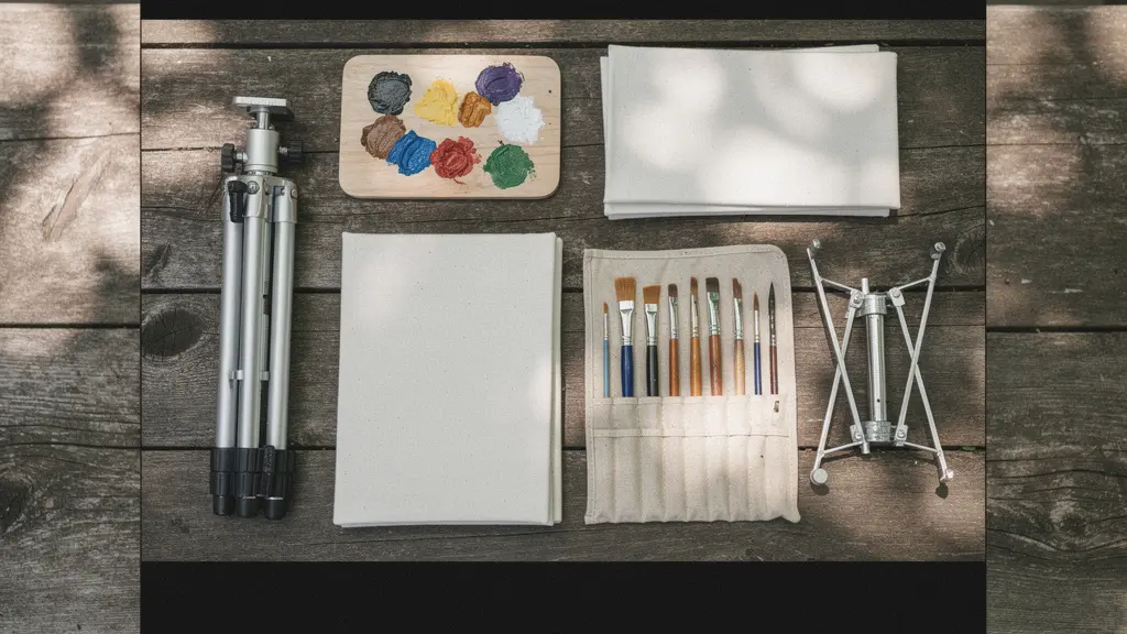
To paint light, you must go where the light is. Painting “en plein air” (outdoors) was not just a philosophy for the Impressionists; it was a practical necessity. However, the romantic image of an artist in a field often omits the logistical nightmare of hauling heavy equipment. A cumbersome kit is a creative killer. The goal is to create a system so light and efficient that it becomes an extension of your body, allowing you to react instantly to a fleeting effect of light. The modern painter has access to incredible innovations in lightweight, modular gear that make a sub-5kg kit not just possible, but practical.
The core components of any plein air kit are an easel/tripod, a palette, panels, and paints. The mistake most beginners make is buying a bulky, all-in-one wooden “French easel.” A far better approach is a modular system built around a lightweight photography tripod. This allows you to upgrade or swap individual components, such as a panel holder or a palette, without replacing the entire setup. Brands have developed incredibly compact systems that prioritize both stability and portability, often designed to fit within airline carry-on limits.
The table below compares several popular lightweight systems. Notice how they cater to different needs, from the minimalist who prizes durability to the traveling artist who needs a kit that can fit under an airplane seat. The key is to analyze your own process: Do you hike far? Do you paint large? Do you travel? Your answers will determine the best system for you.
This table of popular lightweight easel systems, drawn from commercial offerings, shows a clear trend toward modularity and specialized materials. As this data from En Plein Air Pro and other manufacturers illustrates, artists now have options that are a fraction of the weight of traditional setups.
| System | Weight | Key Features | Best For |
|---|---|---|---|
| LederEasel Kit | 1.8kg total | Steel & hardwood, holds up to 24″ panels | Minimalists seeking durability |
| En Plein Air Pro Traveler | 3.86kg complete | Fits under airplane seat, watercolor optimized | Travel painters |
| Soltek Compact | 2.8kg | Separates into two pieces, friction-lock legs | Quick setup needs |
| Sienna Plein Air Basic | Under 4kg with tripod | Modular system, add components as needed | Budget-conscious artists |
Plein Air Sketch or Studio Finish: Which Approach Suits Your Style?
A common misconception is that Impressionist paintings were completed in a single, frenzied outdoor session. While the initial spark of inspiration and vital color information were captured on-site, many iconic works were refined or even completed in the studio. Claude Monet, the quintessential plein air painter, developed a “Serial Painting” method for his Haystacks and Rouen Cathedral series. He would work on multiple canvases at once, dedicating just 20-30 minutes to each one at the exact same time of day, over many days. This allowed him to capture a very specific, fleeting light effect while still allowing for considered, deliberate brushwork—a perfect marriage of outdoor observation and studio discipline.
This raises a crucial question for the modern painter: is your goal to create a finished piece outdoors, or to gather data for a more developed studio painting? There is no right answer, only the approach that suits your temperament and artistic goals. The “alla prima” (wet-on-wet, single session) painter thrives on energy and spontaneity. The studio painter seeks control and refinement. An increasingly popular and powerful method is the hybrid workflow, which uses plein air time for efficient data collection.
In this hybrid model, your outdoor goal isn’t a finished painting. It’s to create a library of essential information that you cannot get from a photograph: the true temperature of the light, the subtle value shifts in the shadows, and the real-life color relationships. A photograph flattens values and distorts colors. Your eye is a far superior tool. By creating quick color maps, value sketches, and compositional notes, you return to the studio with a rich dataset that empowers you to create a more authentic and compelling painting.
This approach combines the best of both worlds: the raw, truthful color of the outdoors and the focused, contemplative environment of the studio. It allows you to work larger and with more complexity than is often possible on-site.
The Blending Mistake That Kills the Luminosity of Your Impressionist Work
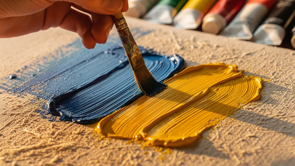
Here is the most destructive habit that sabotages an aspiring Impressionist’s work: physically blending colors on the canvas. When you take a brush and smooth the transition between a light and a dark passage, you are not creating softness; you are murdering luminosity. You are physically mixing pigments and creating a new, intermediate color that is invariably duller and less vibrant. This is the fast track to “mud.” The entire genius of the “broken color” technique is to avoid this. The goal is to place clean, distinct strokes of color side-by-side and let the viewer’s eye perform the mixing. This is called optical mixing.
Think of a classic television screen. From a distance, you see a full-color image. But up close, you see it’s composed of tiny, distinct dots of red, green, and blue. Your brain blends them into millions of colors. This is precisely the principle the Impressionists harnessed. When a stroke of yellow is placed next to a stroke of blue, your eye mixes them from a distance to see a vibrant, shimmering green. If you had mixed that same yellow and blue on your palette, you would have created a single, flat, and far less interesting green. Indeed, studies on perception show that 90% of an artwork’s luminosity is preserved when colors mix optically rather than physically on the canvas.
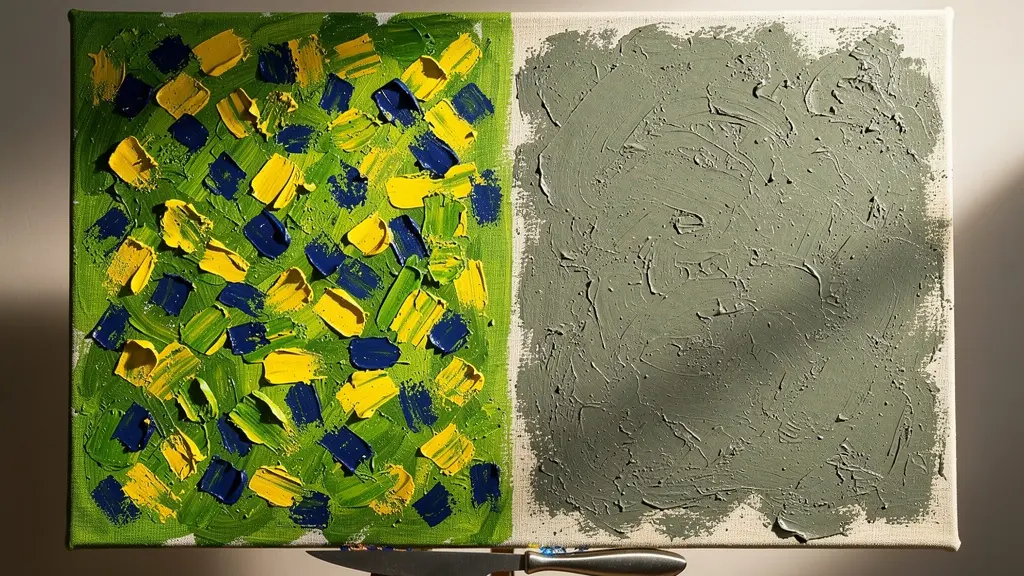
Preserving this luminosity requires discipline. You must learn to lay down a brushstroke and leave it alone. Trust that the relationship between adjacent strokes will create the desired effect. If you do find an area has become contaminated and muddy, do not try to paint over it. The best course of action is to scrape the offending paint off with a palette knife, clean the area, and re-apply clean, distinct shapes of color. It is always better to have a “patchwork” of clean colors than a smoothly blended field of mud.
Your Action Plan: Luminosity Rescue for Muddy Colors
- Identify contaminated areas where light and dark values have mixed into a single, dull tone.
- While the paint is still wet, decisively scrape back the contaminated paint with a clean palette knife.
- Thoroughly wipe the palette knife between each scrape to avoid re-contaminating the canvas.
- Re-apply clean, distinct shapes of color, ensuring light and dark values do not physically touch while wet.
- Instead of blending, use techniques like cross-hatching or stippling to create transitions between color areas.
When Is the ‘Golden Hour’ Actually Too Fast for Painting Outdoors?
The “golden hour”—that magical period shortly after sunrise and before sunset—is worshipped by photographers for its warm, dramatic light and long shadows. Painters are often told to seek it out, but here lies a counter-intuitive truth: for a painter learning Impressionist techniques, the golden hour can be a trap. The light changes so rapidly that you are in a constant state of chasing it. By the time you’ve mixed a color to match a shadow, the shadow has moved and its color has changed. This frantic pace encourages hurried, sloppy brushwork and prevents careful observation.
While a master painter can use this rapid change to their advantage, a student needs more stability to practice the core principles of color temperature and value relationships. The golden hour’s warm yellow light produces exquisitely subtle blue-violet shadows, but capturing their value, edge quality, and temperature before they vanish is an advanced skill. The constant movement of the sun means you have maybe 15-20 minutes of consistent light, which is often not enough time to establish the main color masses of your composition.
Instead of chasing the fleeting drama of the golden hour, consider practicing in “slow light” conditions. These environments provide stable, consistent light over several hours, giving you the time to observe, mix, and apply color deliberately. An overcast day, for instance, is a painter’s gift. It provides soft, diffused, cool light with no harsh shadows, allowing you to focus purely on the local color of objects and their subtle shifts in value. Similarly, the light from a north-facing window is famously consistent and cool, making it ideal for indoor practice. Mastering your technique in these stable conditions will give you the confidence and speed to eventually tackle the beautiful chaos of the golden hour.
Your Action Plan: Finding ‘Slow Light’ Alternatives for Practice
- Overcast Days: Seek out cloudy days for consistent, cool light that eliminates fast-moving shadows and simplifies value structures.
- North-Facing Windows: Use the stable, cool light from a north-facing window for indoor still life or portrait practice.
- Mid-Morning Light: The period two to three hours after sunrise offers more stable light and shadow patterns than the golden hour itself.
- Controlled Studio Setup: Use a single, consistent artificial light source in your studio to master technique without any time pressure.
- The “Blue Hour”: The 20-30 minutes *after* the sun has set offers a beautifully diffused and surprisingly stable cool light.
Why Does Red Look Brighter Next to Green Than Next to Orange?
The answer to this question lies in a scientific principle that was central to Impressionist theory: simultaneous contrast. This phenomenon, studied by chemist Michel Eugène Chevreul, describes how the perception of a color is affected by the colors surrounding it. Our eyes and brain automatically seek to balance what we see. When you place a color next to its complement (the color opposite it on the color wheel), your brain intensifies both. Red, a primary color, appears most vibrant and saturated next to its complement, green. Place that same red next to an analogous color like orange, and the effect is muted; they share yellow and thus have less contrast, appearing calmer.
The Impressionists were masters of exploiting this. They didn’t just paint what they saw; they engineered color relationships to create specific effects. They would place strokes of orange and blue side-by-side in a sunset, knowing that the simultaneous contrast would make both colors sing with more intensity than if they were isolated. This is the science behind the “vibration” of their canvases. It’s an optical effect created by placing complementary or near-complementary colors in close proximity.
You can use this principle strategically to guide the viewer’s eye. By surrounding your focal point with its desaturated, muted complement, you can make the focal point appear exponentially more vibrant. For example, to make a red flower the star of your painting, surround it with dull, grayed-out greens. The most saturated, brilliant red should be reserved only for the flower itself. This creates a powerful visual hierarchy, telling the viewer exactly where to look. This is a far more sophisticated approach than simply making the flower “brighter” by adding white, which would actually cool the color and reduce its saturation.
Your Action Plan: Amplifying a Focal Point with Color
- First, identify the focal point of your composition and determine its dominant color (e.g., a red boat).
- Surround this focal point with its muted, desaturated complementary color (in this case, dull greens and blue-greens for the water).
- Ensure the complementary colors have different values (one lighter, one darker) to prevent an unpleasant, jarring vibration.
- Use the purest, most saturated version of your focal color only at the most important point.
- From a distance of 6-10 feet, squint at your painting to check if the effect is working and the focal point immediately draws your eye.
How Did ‘Japonisme’ Change the Composition of Van Gogh’s Art?
While color theory was one pillar of the Impressionist revolution, a radical shift in composition was another, largely thanks to the influx of Japanese art into Paris in the mid-19th century. The craze for all things Japanese, known as “Japonisme,” introduced Western artists to a completely different visual language through ukiyo-e woodblock prints. These prints, by masters like Hiroshige and Hokusai, broke all the rules of traditional European academic composition. They favored asymmetry, radical cropping, flattened perspectives, and the use of bold, empty space. For an artist like Vincent van Gogh, this was a profound revelation.
Van Gogh’s work can be clearly divided into a “before” and “after” his encounter with ukiyo-e prints. His early Dutch work is dark, heavy, and conventionally composed. After arriving in Paris and discovering these prints, his entire approach transformed. He began to directly copy works by Hiroshige, but more importantly, he assimilated their principles into his own vision. This is evident in his use of strong diagonal lines to create energy, high horizon lines to flatten the sense of space, and bold outlines around objects. Most famously, as noted in analyses of his work, Van Gogh’s integration of flattened color areas and asymmetrical compositions, such as placing a tree trunk prominently off-center, became hallmarks of his iconic, emotionally charged style.
These Japanese principles offered a way to capture the “snapshot” immediacy of modern life that so fascinated the Impressionists. Cropping a figure at the edge of the frame, as Degas often did, gives the viewer the sense that they are a bystander catching a fleeting glimpse of a scene. Using negative space (known as ‘Ma’ in Japanese aesthetics) not as a passive background but as an active, powerful shape in the composition, creates a more graphic and dynamic design. These are not just stylistic tics; they are powerful tools for creating mood and directing the viewer’s attention.
Checklist: Auditing Your Composition with Japonisme Principles
- Asymmetry: Have you placed your main subject off-center, perhaps using the rule of thirds, to create a more dynamic balance?
- Cropping: Are there elements that are radically cut off by the edge of the frame to suggest a larger world beyond the canvas?
- Negative Space: Is the “empty” space in your painting just a background, or does it form an interesting, active shape that contributes to the overall design?
- Perspective: Have you deliberately flattened the sense of deep space by minimizing atmospheric perspective and using bold, continuous shapes?
- Line: Are there strong diagonal lines (a path, a fence, a shoreline) that lead the eye through the painting and create a sense of movement?
Key Takeaways
- Stop using black in your shadows; they are filled with the cool, blue light of the sky and should be treated as a color, not a value.
- Resist the urge to blend on the canvas. Place clean dabs of color side-by-side to create vibrant optical mixtures in the viewer’s eye.
- Every brushstroke should have a purpose. Match your mark-making to the texture and energy of the subject you are depicting.
How to Develop a Unique Brushwork Signature That Collectors Recognize?
Beyond color and composition, the final element of an Impressionist’s identity is their brushwork—their handwriting in paint. Think of the thick, directional, writhing strokes of Van Gogh, the soft, feathery dabs of Renoir, or the choppy, blocky marks of Cézanne. Each mark is not just a deposit of color; it is a record of energy, emotion, and observation. Developing a personal and recognizable brushwork signature is what elevates a competent painter to a memorable artist. This doesn’t happen by accident; it’s the result of conscious exploration and practice.
A critical insight is that master Impressionists used functional brushwork. Their marks were not random or merely decorative; they were chosen to describe the subject. As analysis of their work shows, Pierre-Auguste Renoir used short, choppy strokes specifically for the shimmering reflections on water, contrasting them with smoother passages for skin. Van Gogh used thick, directional strokes in his fields to convey the texture and energy of growing grass. The brushstroke serves the subject. A quiet, still sky might call for smooth, horizontal strokes, while a turbulent sea demands energetic, multi-directional marks.
To find your own signature, you must experiment methodically. The “30-Day Brush-a-Day Challenge” is a structured way to do this. For 30 days, you create one small study (e.g., 6×6 inches) each day, focusing on a single variable. One day, you might use only a large flat brush. The next, only a palette knife. You could explore different medium consistencies, from thick impasto paint straight from the tube to thin, watery glazes. You can also vary your physical gesture, from small flicks of the wrist to large sweeps of the entire arm. By isolating one variable at a time, you will discover which tools, mediums, and gestures feel most natural and expressive for you. This deliberate practice builds a personal vocabulary of marks that will eventually become your unique and recognizable signature.
Start your journey today by undertaking the 30-day brushwork challenge or setting up the two-lamp still life. The path to a luminous, vibrant painting style begins not with a grand masterpiece, but with the first deliberate, educated brushstroke.