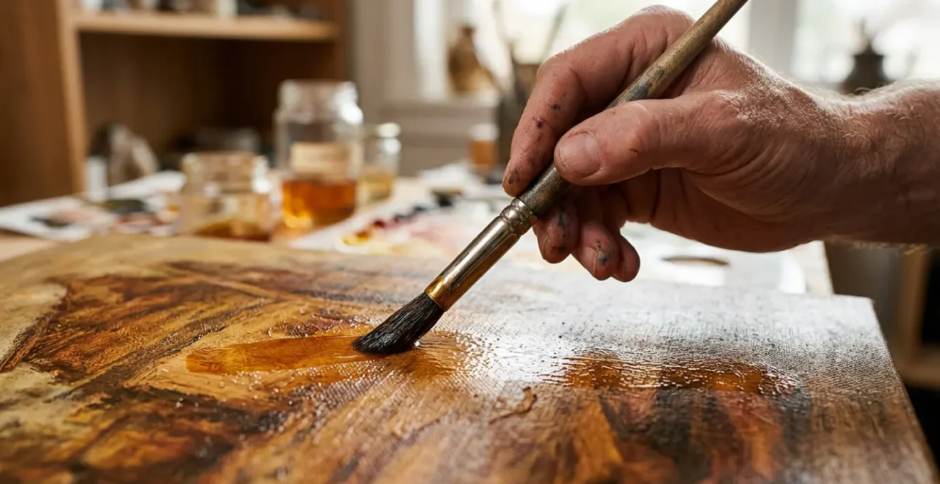
The key to luminous depth is not simply applying thin paint, but engineering how light interacts with your canvas by treating each glaze as an optical filter.
- Choose your medium based on its specific optical properties and archival stability, not just its drying time.
- Embrace optical mixing—layering transparent colors—to create hues that are more vibrant and alive than any physically mixed paint.
- Manage your workflow with strategic, parallel processes to overcome the challenge of slow-drying layers.
Recommendation: Start thinking of your paint not as a covering, but as a series of translucent, colored lenses you are stacking to build light and form from within.
For many painters, a persistent frustration lingers. Your work feels solid, the colors are accurate, yet it lacks that ineffable glow seen in the paintings of the Old Masters. Your surfaces appear flat, opaque, and somehow inert, while theirs seem to breathe with an inner light. The common advice is to “use glazes,” which is often interpreted as simply thinning down paint and applying transparent layers. But this is like telling an aspiring architect to “just use bricks.” It misses the fundamental principle that gives the technique its power.
The true magic of glazing isn’t a secret recipe or a forgotten medium. It’s a radical shift in thinking. Instead of seeing paint as a covering, the masters saw it as a tool for optical engineering. They weren’t just painting a surface; they were constructing a light-path. Each glaze is a filter, a colored lens that intercepts, modifies, and reflects light. The resulting color and depth are not on the canvas, but are an illusion created in the eye of the viewer—a phenomenon known as structural color, much like the iridescent shimmer of a butterfly’s wing.
This article will guide you through that mental shift. We will move beyond the basic mechanics of the technique to explore the science and strategy behind it. You will learn not just how to apply a glaze, but how to think like a light engineer. We will dissect the choice of mediums, understand the physics of optical color, develop a professional workflow for managing drying times, and even see how this method was used to create some of the most iconic effects in art history.
To navigate this deep dive into the art of luminosity, this guide is structured to build your understanding from the ground up. The following sections will walk you through the essential components of mastering the glazing technique, from material choices to advanced application.
Summary: The Old Masters’ Secret: How to Achieve Luminous Depth with Oil Glazing
- Stand Oil or Damar: Which Medium Mixture Creates the Smoothest Glaze?
- Why Does Optically Mixed Green Look More Vibrant Than Tube Green?
- How to Manage a Glazing Workflow When Layers Take Days to Dry?
- The Oiling Out Mistake That Ruins the Unity of Your Glazed Surface
- Which Color Should You Glaze First to Create a Glowing Skin Tone?
- Why Do Impressionist Shadows Look Blue Instead of Black?
- Thick Impasto or Thin Glaze: Which Technique Builds More Depth?
- How to Develop a Unique Brushwork Signature That Collectors Recognize?
Stand Oil or Damar: Which Medium Mixture Creates the Smoothest Glaze?
The first decision in engineering light is choosing the “lens” itself: your glazing medium. This choice is not merely about consistency or drying time; it dictates the optical quality and archival future of your work. The two most traditional and debated options are stand oil and damar varnish, each offering a distinct pathway to luminosity. Your selection should be a conscious one, based on the specific effect you wish to achieve.
Stand oil, a polymerized linseed oil, is prized for its self-leveling properties. When mixed with a solvent like turpentine, it creates a smooth, enamel-like finish that minimizes brushstrokes. This is the medium for creating soft, atmospheric depth, where forms seem to emerge from a subtle haze. Its real strength, however, is archival. Stand oil is significantly less prone to yellowing and remains flexible over centuries, protecting the paint film from cracking. In contrast, damar varnish offers a brilliant, jewel-like gloss. Its sticky quality helps subsequent layers adhere, but this comes at a cost. Archival studies show that damar resin can begin to yellow and crack in as little as two years, eventually becoming brittle and compromising the integrity of your painting.
Modern alkyd mediums like Galkyd or Liquin offer a third path, combining rapid drying times with a durable, non-yellowing film. However, they lack some of the unique handling properties of traditional oils. The choice is a balance between visual effect, working time, and longevity.
To make an informed decision, it’s helpful to see the properties side-by-side. The following comparison breaks down the key characteristics of these two foundational mediums.
| Medium Property | Stand Oil | Damar Varnish |
|---|---|---|
| Flow Characteristic | Self-leveling, enamel-like smooth finish | Faster tack, holds brushstrokes and texture |
| Archival Stability | Non-yellowing, greater flexibility over decades | Yellowing tendency, becomes brittle with age |
| Visual Effect | Atmospheric haze, subtle depth | Jewel-like brilliance, high gloss |
| Adhesion | Moderate | Sticky quality aids paint adhesion to dry layers |
Why Does Optically Mixed Green Look More Vibrant Than Tube Green?
The core principle that gives glazing its power is optical color mixing. When you physically mix a blue and a yellow paint on your palette, you are creating a subtractive mixture. Each pigment absorbs certain wavelengths of light, and what you see is the limited spectrum they both reflect. The result is often a green that is serviceable, but can feel dull or chalky. Optical mixing through glazing completely upends this process. It is a form of additive luminosity, where light itself does the mixing for you.
Imagine a solid blue underpainting that is fully dry. You then apply a thin, transparent layer of yellow glaze over it. Light travels from the room, passes through the yellow “filter” of your glaze, strikes the blue layer underneath, and reflects back to your eye, passing through the yellow filter a second time. Your brain, not your palette knife, mixes the colors. As the Virtual Art Academy notes in its guide on glazing, this is the essential distinction. They state clearly:
When using glazing in oils or acrylics, you do not physically mix the glaze and the underpainting, but optically mix them.
– Virtual Art Academy, Glazing Techniques In Oil Painting
The resulting green appears more vibrant because it is composed of pure, transmitted light, not muddied pigment. It has a depth and complexity that physical mixing cannot replicate. You are literally looking *through* one color to see another, creating a visual that is rich and alive. This is the secret to the glow of a Renaissance emerald robe or the deep, liquid shadows in a Caravaggio.
This principle applies to all colors. A glazed red over a yellow underpainting will create a far more fiery orange than one mixed on the palette. By mastering this concept, you move from being a color mixer to a light manipulator, building color in space rather than just on a surface.
How to Manage a Glazing Workflow When Layers Take Days to Dry?
The single greatest practical challenge of oil glazing is the drying time. The advice to “be patient” is of little help when studio time is limited and momentum is key. A professional approach requires a strategic workflow designed to turn this downtime into productive time. Instead of waiting for a single painting to dry, you must learn to work in parallel and manage your materials intelligently. The goal is to always have a surface ready for the next step.
First, consider your pigments. Not all oil colors dry at the same rate. Earth tones like umbers and siennas, which contain manganese, are fast driers. Pigments like cadmium red or ivory black can take a week or more to be dry enough for the next glaze. According to technical data from paint manufacturers, drying times can range from 1-2 days for umbers to over a week for cadmiums. Planning your underpainting with faster-drying colors can significantly accelerate the initial stages.
Second, embrace a rotational workflow. Working on three or four paintings simultaneously is a common practice among artists who rely on glazing. While one painting is curing, you can be applying an underpainting to a second, a first glaze to a third, and refining a fourth. This creates a continuous cycle of activity, ensuring that you are always moving forward. This requires organized studio space, particularly vertical drying racks to keep tacky surfaces safe from dust while maximizing your footprint.
Finally, you can strategically use modern materials to speed things up without compromising the integrity of the work. Using an alkyd-based medium like Liquin for the initial drawing and underpainting layers can make them touch-dry in under 24 hours, allowing you to begin the more delicate and slow-drying oil glazes much sooner. These strategies transform a passive waiting game into an active, efficient professional practice.
Your Action Plan: Managing Slow-Drying Glazes
- Establish a Rotation: Begin working on multiple paintings at once. While one cures, progress on another to maintain momentum.
- Map Your Pigments: Inventory your paints by drying time. Use fast-drying colors like umbers for foundational layers to reduce initial wait times.
- Implement Sectional Work: Divide large canvases into zones. Glaze one section while an adjacent one dries, allowing you to keep working on the same piece.
- Optimize Your Studio: Set up vertical drying racks in a dust-free, well-ventilated area to safely store and manage multiple works in progress.
- Use Accelerants Wisely: Incorporate fast-drying alkyd mediums for underpaintings or add siccatives (driers) sparingly to your medium, always following manufacturer instructions to avoid cracking.
The Oiling Out Mistake That Ruins the Unity of Your Glazed Surface
As you build up glaze layers, you may encounter a frustrating issue known as “sinking-in.” This occurs when the oil from a new paint layer is absorbed by a more porous layer beneath it, leaving a dull, matte patch that disrupts the uniform gloss of your surface. The common fix for this is a technique called “oiling out.” However, if done incorrectly, this supposed remedy can cause irreparable damage, permanently yellowing your painting and ruining the very unity you seek to restore.
The mistake lies in applying too much oil and leaving it on the surface. Oiling out is not meant to add a new layer, but to resaturate the sunken area just enough to match the gloss of the surrounding paint film. The correct procedure is delicate. Chuck Black, in his guide to the technique, advises a precise application:
Apply the mixture to the painting surface and let it sit anywhere from 30 seconds to a minute, then wipe off the excess with a clean rag, leaving just enough to saturate the color without creating an additional layer.
– Chuck Black, Oiling Out Paintings 101
Applying oil over areas that are not immediately going to be repainted is a critical error. Any excess oil left on the surface will oxidize, yellow, and become a permanent, disfiguring part of the paint film. Prevention is always better than correction. Ensuring your canvas is properly prepared with a non-absorbent ground is the best defense against sinking-in. But when it does happen, the approach must be surgical.
Case Study: The Dangers of Improper Oiling Out
Conservation research from sources like Just Paint, analyzing historical paintings, has shown the long-term consequences of improper technique. Studies found that excessive oiling out, especially when applied broadly rather than just to the dead spots being repainted, led to significant and irreversible yellowing and structural failures over time. The research underscores that oiling out becomes a permanent part of the paint film. This highlights the importance of preventing sink-in through proper ground preparation and, when correction is necessary, using the absolute minimum amount of medium required to restore luster only to the area being worked.
Which Color Should You Glaze First to Create a Glowing Skin Tone?
Creating luminous, believable skin tones is one of the ultimate tests of the glazing technique. The common approach of mixing a single “flesh color” on the palette inevitably leads to a flat, mannequin-like appearance. Living skin is not one color; it is a complex, translucent layering of tissues, blood, and fat. To replicate it, you must build it anatomically, using glazes to represent these different biological layers. The process begins not with a warm color, but a cool one.
The traditional method, perfected during the Renaissance, starts with an underpainting called a verdaccio—a dull, greenish-grey base. This may seem counterintuitive, but this cool layer serves a vital purpose. It represents the deeper, deoxygenated blood in veins and the cool tones of subcutaneous tissue. It provides the visual depth and temperature contrast against which the warmer surface tones will glow. When you later apply thin, transparent red glazes over this verdaccio, you are optically mixing a cool and a warm, creating a neutrality in the shadows that feels far more natural than a shadow mixed with black or brown.
The sequence of glazing is therefore an anatomical construction:
- The Underpainting: A cool verdaccio or blue-grey layer establishes the deep structure and cool undertones of the flesh.
- The Blood Layer: A very thin glaze of a transparent red, like Alizarin Crimson or Quinacridone Rose, is applied to the mid-tones and areas where blood is close to the surface, such as the cheeks, nose, and ears.
- The Epidermis Layer: A final, warm glaze of a transparent yellow ochre or Naples yellow is applied over the top, representing the skin itself. This final layer unifies the underlying temperature shifts and creates the characteristic warm glow of living flesh.
By building the skin from the inside out—from cool deep tissue to warm surface capillaries—you create a powerful illusion of light emanating from within the form. You are not just painting skin; you are engineering the perception of life.
Why Do Impressionist Shadows Look Blue Instead of Black?
The Impressionist movement marked a seismic shift in how artists saw the world, and their treatment of shadows is a perfect illustration of their revolutionary vision. Before the Impressionists, shadows were traditionally rendered with blacks, browns, or other dark neutrals. They were treated as an absence of light. The Impressionists, painting outdoors (*en plein air*), realized that shadows are not an absence of light at all; they are filled with reflected, ambient light. And on a clear day, the primary source of that ambient light is the vast, blue sky.
Instead of seeing a shadow on a haystack as “dark,” Monet saw it as being filled with the blue and violet light reflecting from the sky. This is not an artistic choice for emotional effect; it is a scientific observation of optical physics. They were painting what they actually saw. They used optical mixing—placing daubs of pure blue, violet, and other cool colors next to each other in the shadow areas—to let the viewer’s eye blend them into a vibrant, luminous darkness. This approach created shadows that were full of color and air, contributing to the overall sense of a fleeting, light-filled moment.
This observation is not limited to the Impressionist style. The principle can be applied in a more classical, blended glazing technique to achieve greater atmospheric depth. As one artist from the Old Masters Academy explains, the concept translates directly:
A thin, blue glaze can be used to unify and push back shadow areas in a more classical painting, applying the Impressionist observation of ambient light in a different technical context. This creates atmosphere and depth rather than creating flat holes in the composition.
So, Impressionist shadows are blue because they are accurately depicting the color of the ambient light that fills them. Using a thin blue glaze over your shadow areas—even in a highly realistic painting—can prevent them from looking like dead, black holes in the canvas. It infuses them with atmosphere and connects them to the overall light environment of the scene.
Thick Impasto or Thin Glaze: Which Technique Builds More Depth?
Painters have two primary tools to create a sense of depth: impasto and glazing. At first glance, they seem like complete opposites. Impasto involves applying thick, textural paint that stands up from the canvas, while glazing is about whisper-thin, transparent layers. Both create depth, but they create two fundamentally different *types* of depth: physical and optical. Understanding this distinction is key to choosing the right technique for the subject you are painting.
Impasto creates physical depth. The thick paint literally sculpts the surface, catching light and casting real, micro-shadows that change as the viewer moves or as the lighting in the room shifts. This technique is perfect for conveying rough, tangible surfaces like tree bark, crumbling stone, or heavy, woven fabric. The depth is real and invites a tactile, physical inspection from the viewer. It asserts the presence of the paint itself.
Glazing creates optical depth. It does not build up the surface; instead, it creates the illusion of looking down *into* the surface. The light is not caught on top but travels through the translucent layers, creating a consistent internal glow that is independent of the room’s lighting. This is the technique for ethereal and smooth surfaces: skin, silk, glass, calm water, or the sky at dusk. The experience for the viewer is one of being pulled into the painting’s world. The depth is an illusion of space and light.
Neither technique is superior; they simply serve different expressive purposes. The most advanced practitioners, like Rembrandt, often combined both, using thick impasto in the highlights to physically catch the light, and deep, transparent glazes in the shadows to create a sense of receding space. This combination of physical and optical depth creates an unparalleled sense of realism and dynamism.
| Depth Type | Impasto Technique | Glazing Technique |
|---|---|---|
| Nature of Depth | Physical depth – creates real shadows on surface | Optical depth – creates illusion of looking through translucent substance |
| Light Interaction | Changes with viewing angle and room lighting | Consistent internal glow that pulls viewer into painting’s world |
| Best Suited For | Rough, tangible surfaces (bark, rock, heavy fabric) | Ethereal or smooth surfaces (skin, silk, water, glass) |
| Viewer Experience | Invites closer physical inspection | Creates luminous quality and atmospheric effect |
| Advanced Technique | Glazing over impasto combines both – glaze pools in crevices, thins on peaks for rich texture with luminosity | |
Key takeaways
- True luminosity comes from engineering light with transparent layers (optical mixing), not just mixing colors on a palette (physical mixing).
- Your choice of medium (e.g., Stand Oil for smoothness, Damar for gloss) directly impacts the final optical effect and long-term stability of your work.
- Advanced techniques, such as the verdaccio underpainting for skin tones, rely on layering cool and warm glazes to build form anatomically.
How to Develop a Unique Brushwork Signature That Collectors Recognize?
For an artist, developing a recognizable signature is the path to a distinct and collectible body of work. Often, this is associated with a particular style of brushwork—the energetic slashes of a Franz Kline or the delicate stipples of a Seurat. However, in the context of glazing, a signature can be something far more subtle and profound. It can be your unique “light recipe,” the specific way you build layers, choose colors, and manipulate transparency to create a luminous quality that is yours alone.
Consider the work of Johannes Vermeer. His paintings are instantly recognizable, not primarily for his brushstrokes (which are often invisible), but for his unparalleled handling of light. His signature is the quiet, pearlescent glow that seems to emanate from within his subjects. This was not an accident; it was a highly engineered result of his specific glazing process. He used his glazes strategically, not as an all-over effect, but to enhance specific areas and build unparalleled color saturation.
Case Study: Vermeer’s Light Recipe as a Signature
Analysis of Vermeer’s work, such as the vibrant red hat in “The Girl with the Red Hat,” reveals his signature method. Instead of mixing a flat red, he built the color through multiple, transparent layers of red glaze over an underpainting of pure vermilion and black. This process of layering pure colors, combined with his specific medium choices, created a luminosity and depth of color that became his unmistakable trademark. His signature was not in how his brush moved, but in how he constructed light itself.
Your signature can be found in your own unique combinations. Perhaps it’s a preference for a stand oil medium that creates a soft, atmospheric haze. Maybe it’s a specific sequence of glazes you use to render skies, or a unique cool-toned underpainting that gives all your work a particular mood. Developing this signature requires patient experimentation. Keep meticulous notes. Create test strips with different layer combinations. Over time, you will discover a process and an effect that is uniquely yours—a way of handling light that is as personal and recognizable as a handwritten signature.
Ultimately, mastering glazing is about transforming your mindset. Begin to see your paints as transparent films, your canvas as a deep space, and yourself as an architect of light. Start today by taking a single color and experimenting with glazing it over different-colored underpaintings. Observe, take notes, and begin the journey of discovering your own unique light recipe.