Contrary to the belief that loud work gets noticed, true power lies in quiet intentionality. This guide reveals that minimalist art commands attention not through emptiness, but by engaging the viewer’s mind, making every mark a deliberate commitment and every space an active part of the story.
In a world saturated with visual noise, the pressure to create “louder,” more complex work can feel immense. We are taught that to be seen, we must shout. Artists and designers often find themselves trapped in a cycle of adding more—more color, more elements, more detail—hoping to capture a fleeting moment of a distracted viewer’s attention. The common advice is to stand out by being bold and intricate, filling every corner of the canvas or the screen with information.
But what if this approach is a trap? What if the secret to capturing and holding attention isn’t to add more, but to subtract with profound purpose? The true power of a composition lies not in what is present, but in the deliberate, confident choice of what is absent. This is the core of minimalist discipline. It’s not an aesthetic of emptiness; it is an act of supreme focus. It’s about understanding that the human mind craves clarity and is naturally drawn to compositions that offer it room to think, feel, and participate.
This article moves beyond the cliché of “less is more.” We will explore the active, psychological role of negative space, the discipline required to suggest detail rather than scream it, and the wisdom in choosing a single, perfect mark over a thousand mediocre ones. You will learn to wield subtlety as your greatest strength, transforming empty space from a passive background into an active, compelling subject that draws the viewer in and holds them captive.
This guide explores the principles that allow quiet work to speak volumes. By understanding the psychology of perception and the discipline of intentionality, you can create compositions that offer a moment of profound focus and inspiration in our cluttered world. The following sections will provide a roadmap to mastering this subtle but powerful art form.
Summary: The Principles of Quiet Composition
- Active vs. Passive Void: How to Make Empty Space Felt?
- How to Paint the Veins of a Petal Without Overworking the Detail?
- Silverpoint: Why Use a Medium That Cannot Be Erased?
- The Contrast Error That Makes Delicate Work Look Unfinished
- How to Frame Small Works to Draw the Viewer In Close?
- Why Is “Ma” (Negative Space) More Important Than the Ink Itself?
- How to Arrange Your Office Art to Maximize Focus and Inspiration?
- Is Classical Academic Training Necessary for a Contemporary Career?
Active vs. Passive Void: How to Make Empty Space Felt?
The most common misconception about minimalism is that negative space is simply empty. This is the mark of a passive void—a dead area that adds nothing. An active void, however, is alive. It is a shape in its own right, defined by the forms around it, and it works to guide the viewer’s eye and structure the entire composition. It is not absence; it is a tangible presence. The goal is to make the space between objects as important as the objects themselves.
This works because the human brain is wired to seek patterns and complete information. When you create intentional gaps, you invite the viewer to participate in the act of creation. This psychological principle of closure means the viewer’s mind actively works to fill in the blanks, creating a deeper, more personal connection to the piece. This engagement is far more powerful than passively observing a composition that leaves nothing to the imagination. As the Nielsen Norman Group explains in their work on visual design:
The principle of closure states that people will fill in blanks to perceive a complete object whenever an external stimulus partially matches that object.
– Nielsen Norman Group, Principle of Closure in Visual Design
This cognitive participation is not just engaging; it is calming. By providing clear focal points and reducing unnecessary visual information, you lower the cognitive load required to process the work. A well-composed piece with active negative space doesn’t shout for attention; it earns it by offering a sense of order and peace.
As you can see in the visual representation of this principle, the mind does not perceive random shapes but instinctively organizes them into a coherent whole. By mastering the active void, you are not creating emptiness; you are sculpting with space and directing the viewer’s perception with unseen lines of force. This transforms the viewing experience from a monologue delivered by the artist into a dialogue with the audience.
How to Paint the Veins of a Petal Without Overworking the Detail?
The temptation to render every detail is a common trap for artists striving for realism. When painting something as delicate as a flower petal, the instinct is to paint every single vein, every subtle shift in color. But this often leads to a stiff, overworked result that feels heavy and lifeless. The minimalist approach teaches a more profound form of realism: suggestion is more powerful than statement. Instead of painting every vein, your goal is to suggest the *idea* of veins.
Focus on the essence of the form. Observe how light falls across the petal. Is there one primary shadow that defines its curve? Is there a single, slightly darker line that implies the presence of all the others? By selecting and rendering only one or two key details with precision, you give the viewer’s mind the necessary cues to construct the rest. The brain will automatically understand that a petal has veins, and your subtle hint will activate that knowledge, making the final image feel more real and delicate than a fully rendered, clinical depiction.
This is an exercise in trust—trust in your viewer and trust in the power of restraint. You provide the poetry, and you let the audience build the world. This approach invites focused attention, allowing the mind to add its own meaning and emotion instead of being overwhelmed by visual chaos. The result is a work that breathes, possessing a lightness and grace that is impossible to achieve when every square inch is labored over. The goal is not to show everything, but to select the one critical detail that makes everything else feel present.
Silverpoint: Why Use a Medium That Cannot Be Erased?
To truly understand the discipline of minimalism, consider the historical medium of silverpoint. This is the practice of drawing with a silver stylus on a prepared surface. Its defining characteristic is that the marks cannot be erased. Every line is a permanent commitment. In a digital world of “undo” buttons and endless revisions, this unforgiving nature seems counterintuitive. Yet, it is precisely this limitation that teaches the ultimate lesson in artistic intentionality.
Working in silverpoint forces a state of heightened focus and deliberation. You cannot sketch freely or make tentative marks. You must be certain before your hand moves. This practice cultivates an economy of line where every single mark must be necessary and placed with precision. It is the physical embodiment of the minimalist ethos: think deeply, decide with confidence, and act with finality. There is no room for hesitation or visual clutter, only for the essential. This forces the artist to develop an extraordinary level of confidence and a light touch.
The medium offers another quiet lesson in its evolution. The silver lines, pale grey at first, slowly oxidize over time, tarnishing to a warm, lustrous brown. The drawing is not a static object but a living one that continues to develop long after the artist’s hand has left it. This slow, graceful transformation rewards patience and an appreciation for subtlety.
Case Study: Leonardo da Vinci’s Silverpoint Mastery
Renaissance masters embraced silverpoint’s unforgiving nature to achieve incredible results. According to a study of Leonardo da Vinci’s masterful silverpoint drawings, such as the *Study of a Woman’s Head* (c. 1490), the impossibility of erasure forced extreme intentionality. This made every mark a deliberate commitment, while the silver’s natural oxidation over months created evolving tonal harmonies, teaching a profound lesson in both discipline and patience.
Using a medium like silverpoint is not about making things difficult; it is about cultivating a mindset. It teaches that true artistic freedom is not the ability to do anything, but the wisdom to know exactly what to do and to do it perfectly. It is the ultimate expression of deliberate commitment.
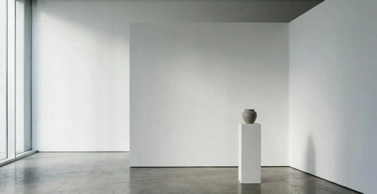
The Contrast Error That Makes Delicate Work Look Unfinished
A common piece of advice in composition is to “push your contrasts.” For loud, graphic work, this is effective. But for delicate, minimalist pieces, it’s a fatal error. When the entire composition operates within a subtle, narrow range of tones, forcing high contrast—like adding a pure black or a pure white—doesn’t make it “pop.” Instead, it shatters the harmony. It makes the subtle parts look weak and the entire piece feel disconnected and unfinished or unresolved.
The solution is not to avoid contrast altogether, but to redefine what “contrast” means in a quiet composition. Instead of a battle between black and white, think in terms of subtle vibrations. The contrast might be between a soft, matte texture and a slightly glossy one. It could be a barely perceptible shift in temperature from a cool grey to a warm one. In a sea of soft edges, a single, carefully placed sharp line can provide a powerful accent without disrupting the overall mood. This is the art of the strategic accent.
A well-placed, subtle accent can be a more powerful signal in a quiet composition than loud, all-over contrast. It acts as a focal point that activates the surrounding negative space and gives the viewer’s eye a place to rest and begin its journey. This single point of emphasis gives weight and intention to the entire piece, proving that all the other subtle choices were deliberate. Without this anchor, a low-contrast work can indeed look timid. With it, it looks confident and masterfully controlled.
This image demonstrates how a single point of focus within a harmonious field of low-contrast textures can command attention. The power is not in the volume of the accent, but in its strategic placement and its relationship to the quiet space around it.
Your Action Plan: Auditing for Subtle Contrast
- Identify Focal Point: Locate the one element intended to be the visual anchor. If you can’t find one, you need to create one.
- Assess Tonal Range: Look at your composition’s lightest light and darkest dark. Are they working in harmony or fighting each other?
- Check for Cohesion: Does your accent feel like it belongs? Or does it look like a mistake that breaks the piece’s unity?
- Test for Subtlety: Ask yourself: could this accent be 50% less intense and still do its job? The answer is often yes.
- Plan for Activation: Ensure your accent isn’t just sitting there, but is actively engaging with the negative space around it to guide the eye.
How to Frame Small Works to Draw the Viewer In Close?
The presentation of a minimalist work is not an afterthought; it is an extension of the composition itself. This is especially true for small works. A common mistake is to use a thin frame or a narrow mat, thinking it is in keeping with the “minimal” theme. In reality, this constricts the artwork, causing it to feel cramped and insignificant. To give a small, quiet piece the presence it deserves, you must give it generous room to breathe.
The secret is to use a disproportionately large mat. A wide, clean expanse of white or off-white space around a small piece does two things. First, it acts as a powerful zone of silence, insulating the artwork from the visual noise of the surrounding environment. It tells the world that this small object is important and deserves its own space. It creates a stage for the work to perform on. This negative space is not just a border; it is an active part of the viewing experience.
Second, this wide frame acts as a funnel, drawing the viewer’s eye inward towards the art. To see the details of the small work, the viewer is forced to physically move closer. This creates an intimate, personal encounter with the piece. The frame is no longer just a protective shell; it is a tool of engagement. It transforms the act of looking from a passive, distant glance into an active, focused investigation. By framing with an abundance of negative space, you are not just hanging a picture; you are curating an experience of intimacy and focus.
Why Is “Ma” (Negative Space) More Important Than the Ink Itself?
In Western design, we call it negative space. But in Japanese aesthetics, there is a far more profound concept: Ma (間). Ma is not just empty space; it is the interval, the pause, the gap between things. It is considered an active and essential element, holding as much importance as the objects, sounds, or actions it separates. As the great designer Alan Fletcher noted, “Space is substance.” Ma is the silent pause between musical notes that gives rhythm its power, or the empty space in a room that makes it feel serene and livable.
In visual art, particularly in traditional ink wash painting (Sumi-e), Ma is the unpainted paper. The artist does not see it as a background to be filled, but as a primary compositional element. The white of the paper is the mist, the sky, the water. The ink gives form to the mountain, but Ma gives the mountain its scale, its atmosphere, and its meaning. The composition is a dialogue between the “is” and the “is not.” Without the conscious and skillful use of Ma, the most masterfully painted stroke is just a mark on a page. With Ma, it becomes a boat on an infinite sea or a single branch against an endless sky.
Case Study: The Kanji Character for Ma
The philosophy of Ma is beautifully captured in its written form. As explored in an analysis of the Japanese concept of Ma, the kanji character (間) combines the symbol for ‘door’ (門) with the symbol for ‘sun’ or ‘day’ (日). The image created is one of sunlight filtering through the opening of a doorway. It is not the door, and it is not the sun, but the space between that holds the meaning. This visual metaphor perfectly illustrates Ma as an active, meaningful interval in both space and time, fundamental to all Japanese arts.
Understanding Ma shifts your perspective entirely. You stop thinking about filling space and start thinking about carving it. You begin to compose not just with lines and forms, but with the silence and the void that surrounds them. This is the heart of minimalist wisdom: recognizing that the most powerful statements are often made by what is left unsaid, unpainted, and untouched.
How to Arrange Your Office Art to Maximize Focus and Inspiration?
The art in your personal workspace is not mere decoration; it is a functional tool that can either contribute to a state of calm focus or add to your cognitive clutter. An office wall crowded with multiple, competing pieces creates a constant, low-level visual distraction that fragments attention. In contrast, a minimalist approach to arranging art can create a powerful anchor for the mind, fostering an environment of clarity and inspiration.
The key is to choose one—or at most two—pieces and give them a dominant position. A single, compelling work with ample negative space serves as a visual resting place. When you look up from your screen, your eyes are not met with chaos, but with a unified, calming composition. This simple act can help reset your focus and reduce mental fatigue. Research on workplace environments and cognitive psychology shows that simplified visual fields can lead to a notable reduction in anxiety and mental strain. According to one analysis on design psychology, a cleaner visual layout can result in a significant decrease in user stress.
The artwork itself should embody these principles. Choose a piece that is not visually demanding. A quiet landscape, a simple abstract form, or a subtle textural work is ideal. The goal is not to have a piece that screams for attention, but one that offers a silent, stable presence. Place it where your gaze naturally falls when you pause. This creates a small ritual of focus throughout the day. By curating your immediate environment with the same intentionality as a minimalist composition, you transform your office from a place of work into a sanctuary for deep thought and sustained inspiration.
Key Takeaways
- True minimalism is not about emptiness, but about deliberate, confident intentionality in every mark and space.
- Active negative space (Ma) is a tangible element that engages the viewer’s mind and brings a composition to life.
- Suggesting detail is more powerful than rendering it completely; trust your viewer to fill in the gaps.
- Mastery comes from discipline; unforgiving mediums like silverpoint teach the profound wisdom of commitment.
- In delicate work, subtle accents and tonal harmony are more effective than loud, disruptive contrast.
Is Classical Academic Training Necessary for a Contemporary Career?
In an age where contemporary art often seems to reject traditional skills, it’s easy to question the relevance of classical academic training. Why spend years learning to render form perfectly if your goal is abstraction or minimalism? The answer lies in a simple truth: you cannot skillfully break a rule you have not first mastered. The ability to subtract, to leave things out with confidence, is a freedom earned only through the discipline of knowing how to put them in.
Classical training is not about learning a specific style; it is about learning the fundamental principles of light, form, and composition. It is about developing an unshakable foundation in draftsmanship. This rigorous training builds a deep, intuitive understanding of how the world is constructed visually. An artist who has spent years drawing from life has internalized the structure of a hand or the turn of a head. They no longer need to render every muscle to convey its form; they can do it with a single, knowing line. Their minimalism is not born of an inability to do more, but of the wisdom to know that more is not needed.
Case Study: The Renaissance Workshop Training Model
The path to minimalist wisdom through maximalist skill is not a new idea. During the Renaissance, artists like Leonardo da Vinci and Michelangelo followed a rigorous training system. As detailed in a history of the evolution of artistic training, apprentices first had to master difficult techniques like silverpoint, copying and memorizing traditional motifs. This foundation in meticulous execution—learning “everything that is possible to paint”—is precisely what empowered them to later make profound choices about what to leave out, transforming technical mastery into subtractive wisdom.
This foundational skill is what separates intentional, powerful minimalism from empty, simplistic work. The former is a choice, the latter a limitation. While a formal academic degree may not be a prerequisite for a successful career, the discipline and knowledge it represents are invaluable. It gives you the freedom to choose your marks, rather than being limited by them, allowing you to say more with less.
By embracing the principles of intentionality, active space, and subtractive wisdom, you can create work that does more than just occupy a wall—it creates a space for thought, focus, and connection. Start today by applying this discipline to your own work and discover the profound power of quiet confidence.