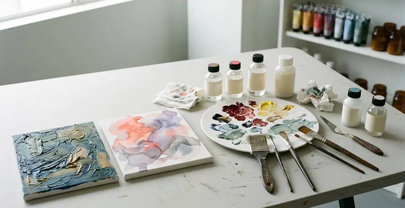
The secret to making acrylics behave like traditional media lies not in simple additives, but in mastering their core polymer chemistry.
- Unlock extended blending times and oil-like textures by choosing the right system: OPEN Acrylics or a specialized wet palette setup.
- Eliminate the “plastic” look by using a professional multi-layer varnishing system that controls sheen without sacrificing color depth.
Recommendation: Start by selecting one specific technique—like the “Seal-the-Edge” method for sharp lines—to build confidence and see immediate, professional-grade results in your work.
For many painters, acrylics represent a frustrating paradox. We love their speed, versatility, and low odor, but often feel trapped by their inherent nature: the fast drying time that prevents subtle blending and the characteristic satin sheen that can feel synthetic or “plastic” compared to the deep, lustrous finish of oils. The common advice often feels like a compromise. We’re told to just add water to create watercolor-like washes, often at the risk of creating a weak, underbound paint film. Or we’re told to add a generic retarder, which can feel like a clumsy solution that only delays the inevitable rapid drying.
But what if the goal wasn’t to fight against acrylics, but to learn their language? The true potential of this medium is unlocked when you stop thinking about them as a “fast” alternative and start seeing them as a sophisticated system of polymer chemistry. By understanding how the binders, pigments, and mediums interact at a molecular level, you can gain precise control over their behavior. You can make them flow with the grace of watercolor or remain open and blendable for hours, just like oils. It’s not about finding a single magic bullet additive; it’s about building a system of techniques and materials.
This guide is your deep dive into that system. We will move beyond the basic tips and explore the professional-grade methods for manipulating acrylics. We’ll examine how to control flow for perfect pouring, how to achieve a truly matte or high-gloss finish without compromise, and how to strategically manage drying times to suit your specific style. We will even explore how these principles of material manipulation extend into the digital realm. Prepare to transform your acrylics from a convenient tool into a medium of infinite expressive possibility.
Summary: Mastering Acrylics for Traditional Media Effects
- Pouring Mediums: How to Control Cells and Flow Without Chaos?
- How to Remove the Shiny Plastic Sheen From Finished Acrylic Paintings?
- Open Acrylics or Wet Palette: Which Keeps Paint Workable Longer?
- The “Water Over Oil” Mistake That Causes Delamination Instantly
- How to Get Razor Sharp Lines Without Paint Bleeding Under Tape?
- Fast or Slow: How Drying Time Dictates Your Painting Style?
- Print and Paint: How to Layer Acrylic Over Digital Prints?
- How to Create Digital Art That Retains a “Painterly” Feel?
Pouring Mediums: How to Control Cells and Flow Without Chaos?
Acrylic pouring can feel like pure chance, but the mesmerizing cells and lacing patterns are a direct result of physics and chemistry. It’s not magic; it’s a battle of densities and surface tension playing out on your canvas. The core principle is that cells form when paints of different densities interact, with heavier pigments wanting to sink and lighter ones wanting to rise. According to acrylic pouring experts, this is the fundamental mechanism behind the iconic look. To control this, you need to become a fluid dynamics strategist, not just a painter.
The first step is to create paint mixtures with varying weights. Pigments themselves have different densities—for example, Titanium White is generally heavier than Carbon Black. By layering these strategically in your pouring cup (lightest at the bottom, heaviest on top), you are pre-loading the physics of the pour. The real control, however, comes from additives. A pouring medium controls viscosity, while a few drops of silicone oil create the “repulsion” effect necessary for distinct cell formation. The key is gentle mixing; you want to create pockets of oil, not emulsify it completely into the paint.
Once poured, your manipulation continues. Tilting the canvas controls the speed and direction of the flow, stretching the cells and creating elegant compositions. For a final touch of precision, a butane torch is your secret weapon. A quick pass of heat lowers the surface tension of the paint and encourages the silicone oil to rise, causing smaller, more intricate cells to pop to the surface. It’s this combination of pre-planned density layering and active surface manipulation that turns a chaotic process into a controlled art form.
As you can see in this close-up, the interaction is a beautiful dance between materials. The crisp edges of the cells are a direct result of controlling surface tension, while the color variations are dictated by the density of the pigments you chose to layer. Mastering this process is about understanding and directing these forces.
How to Remove the Shiny Plastic Sheen From Finished Acrylic Paintings?
One of the most common complaints about acrylics is the uniform, slightly plastic-looking satin sheen that can flatten a finished piece. The knee-jerk solution for many artists is to reach for a matte varnish, but this often leads to a new problem: a cloudy, hazy film that desaturates dark colors and kills the painting’s depth. The professional solution is far more nuanced and involves a multi-layer system designed to control sheen without sacrificing clarity. It’s about building your finish in stages, separating the protective function from the aesthetic one.
The first, non-negotiable step is an isolation coat. This is a permanent, clear gloss layer (often a mix of soft gel gloss and water) applied over the finished painting. It has two critical functions: it unifies the surface by sealing absorbent and non-absorbent areas, and it creates a physical barrier between your painting and the final varnish. This means that if the varnish ever needs to be removed for cleaning or restoration, the painting itself remains untouched. This single step elevates your work from amateur to archival quality.
The Multi-Varnish Layering Method
To achieve professional sheen control, Golden Artist Colors recommends a systematic approach. First, apply an isolation coat using Soft Gel Gloss (2 parts gel to 1 part water) to create a permanent barrier and even out the surface. This prepares the painting for varnishing. After this is dry, you can build up protective layers with a gloss varnish to establish maximum color depth and clarity. Only for the final one or two coats do you apply the desired sheen—satin or matte. This method, detailed in their technical guides on varnishing, prevents the cloudiness that occurs when thick matte varnish is used alone, ensuring dark passages remain rich and deep.
With the isolation coat in place, the secret is to use gloss varnish for your protective layers and only use your desired satin or matte varnish for the final one or two coats. Why? Matte varnishes contain matting agents that are essentially solids, which scatter light to create a non-reflective surface. In a thick layer, these solids obscure the paint film. By using gloss for the initial layers, you maintain perfect clarity and color depth. Then, a thin final coat of matte varnish is all you need to knock back the shine. As the experts at Golden note, there’s an inherent trade-off.
There is no way of applying a satin/matte finish to a dark color without lightening it (the more matte the finish, the more potential for lightening dark areas). To restore the depth of the dark colors, apply a higher gloss to restore some of the sheen.
– Golden Artist Colors Technical Team, Varnish Application Guidelines
Open Acrylics or Wet Palette: Which Keeps Paint Workable Longer?
The race against acrylics’ drying time is the primary reason many artists struggle to replicate oil painting techniques like soft-edged blending and glazing. Two main solutions dominate the conversation: using specially formulated slow-drying paints like Golden OPEN Acrylics, or using standard acrylics on a wet palette. While both extend workability, they are fundamentally different systems, each with a unique feel and ideal use case. Choosing the right one depends entirely on your painting style and project goals.
A wet palette is a DIY or commercial system that uses a sponge and a special permeable paper to create a humid environment, keeping standard acrylics wet for hours or even days. Its greatest strength is color preservation. You can pre-mix a full range of colors and have them remain perfectly consistent for multiple sessions. However, the paint’s consistency can become too fluid if the palette is oversaturated, and it requires maintenance to prevent mold. It keeps your existing paint workable; it doesn’t change the paint’s inherent properties.
Golden OPEN Acrylics, on the other hand, are a different beast entirely. Their polymer chemistry is engineered from the ground up to resist skinning over. They feel more buttery and oil-like right out of the tube and pass through distinct tactile stages as they dry, from slippery to a more resistant, “pully” feel that is excellent for certain blending effects. While they have a greater color shift upon drying than standard acrylics, their extended open time is truly remarkable. Tests show a marble-sized dollop of OPEN Acrylics can remain usable for an incredible 24+ hours with simple misting. This makes them ideal for techniques that require long, uninterrupted blending sessions, like portraiture.
The choice is not about which is “better,” but which is the right tool for the job. Do you need to preserve complex, pre-mixed colors across several days, or do you need a long, continuous blending window for wet-in-wet techniques?
| Characteristic | Golden OPEN Acrylics | Regular Acrylics on Wet Palette |
|---|---|---|
| Working Time (Unattended) | 2-4 hours before surface thickening; up to 24 hours with misting | Hours to days when sealed; requires frequent misting (every 15-30 min when open) |
| Feel & Blendability | Buttery, oil-like; passes through distinct tactile stages from slippery to pully | Maintains original paint consistency; can become too fluid if palette is over-saturated |
| Color Shift on Drying | Greater color shift compared to standard acrylics | Minimal shift; dries true to wet color |
| Setup & Maintenance | No setup required; just squeeze and paint | Requires palette preparation with sponge, distilled water, and permeable paper; risk of mold after 2-3 days |
| Best For | Oil-painting techniques: portraiture, soft edges, extended blending, glazing | Preserving pre-mixed colors; multi-session projects; preventing waste |
| Hybrid Option | Using OPEN Acrylics ON a wet palette extends working time to extreme levels but may cause excessive fluidity and potential pigment separation | |
The “Water Over Oil” Mistake That Causes Delamination Instantly
In the world of painting, there are suggestions, and then there are unbreakable laws. The rule of “fat over lean” in oils is one. An equally critical, yet often misunderstood, law in mixed media is this: you can safely paint oil over acrylic, but you must NEVER paint acrylic over oil. Violating this rule doesn’t just create an aesthetic issue; it guarantees a catastrophic failure of the paint film known as delamination. Your top layer will eventually peel, crack, or lift right off the surface.
The science behind this is straightforward. Acrylic paint dries through water evaporation, forming a non-porous, semi-flexible plastic film. Oil paint, in contrast, “dries” through oxidation, a chemical reaction with the air that hardens the oil into a tough, non-absorbent, and slick surface. When you apply water-based acrylic over this slick, oily surface, there is simply no physical or chemical way for it to get a permanent grip. It’s like trying to paint on a sheet of glass coated in Vaseline. The acrylic layer might stick initially, but with changes in temperature and humidity, the two incompatible layers will separate.
Using acrylics as an underpainting for oils, however, is a time-honored and completely stable technique. The dried acrylic film provides an excellent, toothy surface for the oil paint to adhere to. The key is ensuring the acrylic layer is fully cured, not just touch-dry, before applying any oil-based paint. This prevents any trapped water from interfering with the oil’s adhesion. It’s also vital to be aware of “hidden” oils in your materials; some paint markers or mediums are solvent-based and can create the same delamination risk if you try to layer standard acrylics over them.
This visual metaphor captures the essence of the problem: two materials that fundamentally repel each other. On one side, the rich, toothy surface of acrylic is ready to accept another layer. On the other, the slick, non-porous oil film offers no purchase. To avoid disaster, you must respect this fundamental boundary in polymer chemistry. A simple checklist can help ensure your layers are always stable.
- Rule 1: Oil OVER acrylic is safe and stable—this is a classic underpainting technique. Ensure acrylic is fully dry before applying oil layers.
- Rule 2: NEVER apply acrylic over oil paint. The acrylic film cannot bond to the non-porous oil surface.
- Rule 3: Use isolation barriers—apply ‘universal’ primers or acrylic gessos with sufficient tooth if you are unsure about layer compatibility.
- Rule 4: Check product labels for hidden oils—some markers or mediums labeled ‘oil-modified’ can create delamination risks.
- Rule 5: For transparent washes, watercolor over acrylic gesso is safe. Mineral spirits and oils won’t reactivate dried watercolor.
How to Get Razor Sharp Lines Without Paint Bleeding Under Tape?
Achieving a perfect, razor-sharp edge is the holy grail for hard-edge and geometric painters. Yet, nothing is more frustrating than carefully laying down tape, painting your shape, and peeling it back to reveal a fuzzy, bleeding line. The problem isn’t usually the tape itself, but the microscopic gaps between the tape’s edge and the textured surface of the canvas or paper. Paint, being liquid, will find and exploit every tiny channel. The professional solution isn’t better tape; it’s a technique called “sealing the edge.”
This method creates an infallible barrier that makes it physically impossible for your top color to bleed. After applying your painter’s tape, the secret is to paint a thin layer of either a clear acrylic medium (like a gloss or matte medium) or the existing background color directly over the edge of the tape you want to protect. Any bleeding that occurs will be with this clear medium or matching color, effectively sealing the gap. Once that sealant layer is dry, you can paint your new color right over the top without any fear of it creeping underneath the tape.
The final part of the technique is the removal. Don’t wait for the paint to fully cure. When the top layer is still slightly wet but not tacky, pull the tape off at a 45-degree angle, pulling away from the painted edge. This shears the paint film cleanly and prevents the drying paint from lifting or creating a jagged edge. This complete system—burnish, seal, paint, and peel—is what separates amateur results from professional precision. Even with this method, small imperfections can occur, but pros have a fix for that too.
Professional artists acknowledge that even with perfect technique, paint bleeds can occur. The accepted correction method is to wait until the bleed is completely dry, then carefully scrape back the excess with a sharp blade held at a low angle, or use a fine detail brush loaded with the background color to ‘cut back’ into the fuzzy line, restoring sharpness.
– Professional practice observation
Action Plan: The Seal-the-Edge Masterclass
- Burnish the Edge: Apply painter’s tape and press the edge down firmly using a credit card, bone folder, or your fingernail to eliminate micro-gaps.
- Seal the Edge: Paint a thin layer of clear acrylic medium or the existing background color directly along the tape’s edge. This creates an impermeable barrier.
- Dry Completely: Allow the sealant layer to dry for 15-30 minutes before applying your top color.
- Remove at an Angle: While the top coat is still slightly wet, remove the tape by pulling it back on itself at a 45-degree angle.
- Troubleshoot: For highly textured surfaces, use multiple thin sealant coats. For perfect curves, switch to automotive fine-line tape. For organic shapes, use liquid masking fluid (frisket) instead of tape.
Fast or Slow: How Drying Time Dictates Your Painting Style?
For decades, acrylics were defined by their single, primary feature: they dry fast. This was marketed as an advantage for artists wanting to layer quickly. But for those seeking the soft blends of oil or the wet-in-wet effects of watercolor, it was a major limitation. Today, the conversation has shifted. With the advent of advanced mediums, retarders, and slow-drying paint lines, drying time is no longer a fixed property but a strategic variable. The modern acrylic painter doesn’t just accept a drying time; they dictate it to match their style.
Choosing a fast drying time supports a graphic, hard-edged, or layered approach. It allows you to build up opaque layers of color in rapid succession without muddying the colors underneath. This is ideal for abstract geometric art, illustration, and styles that rely on crisp, clean shapes. You work in discrete, finished sections, making decisions quickly and committing to them. The painting is constructed layer by layer, with each stage becoming permanent within minutes.
Opting for a slow drying time, achieved with OPEN Acrylics or retarder-heavy mixtures, completely changes the game. It opens the door to the full suite of traditional oil painting techniques: seamless blending, soft gradations of color, and “lost and found” edges. You can work the entire canvas at once, pushing and pulling paint, modeling form, and making adjustments for hours. This approach is essential for realistic portraiture, atmospheric landscapes, and any style where the subtle transition between tones is paramount. Advanced artists even mix these approaches within a single painting.
The “Time-Zoning” Technique
Professional illustrators and fine artists often employ a sophisticated ‘time-zoning’ strategy. As detailed in a deep dive on acrylic workability, they use different medium formulations in different areas of a single painting to create variable drying times. For instance, Golden OPEN Acrylics might be used for a sky that requires hours of wet-in-wet blending, while standard heavy-body acrylics are used for foreground architectural elements that need to dry quickly for sharp, crisp layering. This allows them to have a workable time window of hours in one section, and just 10-20 minutes in another, all on the same canvas.
Beyond additives, your environment plays a huge role. As one professional painter noted, “Knowing and controlling your studio air is the least frequently employed tactic and probably the most powerful.” A cool, humid studio will naturally extend your working time, while a hot, dry, or drafty one will accelerate it dramatically. Misting your work area or using a humidifier can be as effective as any medium in your paint.
Print and Paint: How to Layer Acrylic Over Digital Prints?
The line between digital and traditional art is becoming increasingly blurred, and one of the most exciting hybrid techniques is painting with acrylics over a digital print. This allows you to leverage the precision of digital tools for your initial drawing or color block-in, then add the texture, depth, and unique mark-making of physical paint. However, for this to be a successful and, more importantly, an archival process, you must follow a strict workflow to ensure proper adhesion and long-term stability.
The process begins with the print itself. You must use archival pigment-based inks, not dye-based inks. Dye-based inks are not lightfast and will fade over time; they are also more likely to smear when they come into contact with the water in your acrylic paint. The substrate is equally important—print on acid-free paper or a specially prepared canvas designed for giclée printing. This ensures the foundation of your artwork is stable.
Before a single drop of paint touches the print, you must prepare the surface. The printed surface is often non-absorbent and can be prone to smearing. Applying a barrier coat is non-negotiable. A few light coats of a spray fixative (like an archival varnish) or a very thin, evenly applied layer of clear acrylic medium will do the trick. This coat serves two purposes: it locks down the printer ink to prevent smearing and it creates a receptive, toothy surface for the acrylic paint to bond to. For canvas prints where you want a more absorbent, paper-like feel for watercolor effects, you can even apply several coats of an absorbent or watercolor ground over the print.
With the surface prepared, your print becomes a sophisticated underpainting. You can use transparent glazes of acrylic to tint areas while letting the printed detail show through, or you can use opaque paint to build up texture and completely new forms. The key is to think of it as a true mixed-media collaboration, where each medium plays to its strengths. A final crucial step for advanced users is color calibration, creating test prints and physical paint swatches to bridge the gap between the luminous color of your screen (RGB) and the material color of your pigments (CMYK-based).
- Print Selection: Use archival pigment-based inks on acid-free paper or canvas to ensure lightfastness.
- Surface Preparation: Apply a spray fixative or a thin layer of clear acrylic medium over the entire print to prevent ink smearing and create a receptive surface.
- Canvas Ground: For a paper-like, absorbent quality on canvas, apply 3-5 coats of a specialized ground like Watercolor Ground.
- Painting Strategy: Use the print as an underpainting, letting details show through transparent glazes to create hybrid depth.
- Color Calibration: Create a “translation key” by comparing test prints with physical paint swatches to manage the screen-to-pigment color shift.
Key Takeaways
- True control over acrylics comes from manipulating their polymer chemistry with specific mediums, not just adding water or retarder.
- Achieve a perfect, non-plastic finish by using a multi-step system: an isolation coat first, then gloss varnish for clarity, and a final thin layer of matte/satin for sheen control.
- Drying time is a strategic choice. Use OPEN Acrylics for oil-like blending sessions and wet palettes for preserving pre-mixed colors across multiple sessions.
How to Create Digital Art That Retains a “Painterly” Feel?
As we’ve seen, many acrylic techniques are about overcoming the medium’s “perfect” plastic nature to achieve a more organic, traditional feel. Ironically, digital artists face the exact same challenge from the opposite direction. Digital tools offer perfect lines, flawless gradients, and uniform colors. The key to a “painterly” digital piece is to consciously break this perfection and engineer the beautiful imperfections of traditional media.
The first and most important tool is your brush selection. Default round brushes create sterile, uniform marks. To achieve a painterly feel, you must use brushes that mimic the real world: brushes that are asymmetrical, textured, and responsive to pressure and tilt. They should simulate the buildup of paint on bristles, the drag of a dry brush on canvas, and the subtle variations of a natural hair brush. Software like Corel Painter excels at this with its realistic bristle physics, while Procreate and Photoshop have vast libraries of custom brushes designed to create these organic effects.
Beyond the brush, the secret is in the edges and colors. Traditional paintings rarely have perfectly sharp, computer-generated edges everywhere. Use smudge or blur tools to create “lost and found” edges, where a form subtly dissolves into its background. This mimics the effect of wet-in-wet blending in oil or watercolor. Similarly, avoid large, flat areas of a single color. Introduce subtle color variation, noise, or grain to simulate the natural inconsistencies of physical pigments. Finally, adding a low-opacity canvas or paper texture overlay as a final layer can instantly add a sense of material authenticity that grounds the digital image in the physical world.
Essentially, you are using the precise tools of digital software to deliberately fake the happy accidents and material properties of paint. It’s about avoiding perfect symmetry, perfectly straight lines, and perfect uniformity at all costs.
| Software | Core Strength | Best For | Brush Ecosystem |
|---|---|---|---|
| Procreate | Intuitive mobile workflow with natural gesture controls | Quick sketches, portable painting, iPad-native artists | Built-in painterly brushes; excellent third-party support (MaxPacks, GrutBrushes) |
| Adobe Photoshop | Powerful, versatile with extensive brush engine customization | Professional workflows, photo-integration, advanced layer blending modes | Kyle T. Webster’s Megapack (industry standard); vast custom brush marketplace |
| Corel Painter | Specifically designed to mimic natural media with realistic bristle physics | Traditional artists transitioning to digital; oil/watercolor simulation | Real Bristle technology; impasto, glazing, and wet-mixing simulation engines |
| Key Techniques Across All Platforms: Use asymmetrical brushes, add subtle color variation/noise to avoid flatness, employ smudge tools for ‘lost and found’ edges, layer texture overlays simulating canvas weave, avoid perfectly straight lines or symmetrical shapes | |||
Now that you have the tools to manipulate your medium, the next step is to put them into practice. Choose one technique from this guide—whether it’s the “Seal-the-Edge” method or the “Time-Zoning” approach—and apply it to your very next painting. Start experimenting and unlock the true versatility of your acrylics today.