Techniques & materials
The relationship between an artist and their materials is as fundamental as the relationship between a musician and their instrument. Every brushstroke, every color choice, and every surface preparation contributes to the final work’s character, longevity, and emotional impact. Yet the sheer variety of techniques and materials available can overwhelm both emerging artists and experienced practitioners looking to expand their repertoire.
Understanding the technical foundations of visual art empowers you to make informed decisions that align with your creative vision. From the chemical properties that determine how paint ages to the psychological effects of color combinations, mastering these elements transforms uncertainty into confidence. This comprehensive resource connects the dots between material science, historical methods, contemporary innovations, and practical application, giving you the knowledge to choose techniques that serve your artistic goals.
Understanding Materials and Their Impact on Artistic Expression
The materials you select don’t just carry your vision—they fundamentally shape it. A watercolor’s translucent flow creates effects impossible to achieve with opaque oils, while acrylics offer versatility that traditional egg tempera cannot match. Understanding these distinctions helps you align medium with intention rather than fighting against a material’s inherent nature.
Choosing the Right Medium for Your Vision
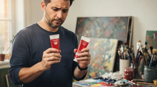
Paint mediums differ dramatically in their working properties and final appearance. Oil paints offer extended working time and rich color depth, making them ideal for blending and building complex layers. Their slow drying allows for subtle gradations, but this same quality can frustrate artists working under time constraints. Acrylics dry rapidly—often within minutes—enabling quick layering but demanding decisive brushwork. Watercolors require planning in reverse, preserving white paper for highlights rather than adding them later. Egg tempera produces luminous surfaces through patient hatching strokes, while gouache combines watercolor’s water-solubility with opacity similar to acrylics.
Beyond aesthetic considerations, practical factors matter enormously. Health and safety concerns make water-based mediums appealing for home studios with limited ventilation. Cost per square inch varies significantly—student-grade paints contain more filler and less pigment, affecting coverage and color intensity. A small tube of professional-grade cadmium red may seem expensive until you realize its superior tinting strength means using half as much paint. Drying time impacts workflow; oil painters often work on multiple pieces simultaneously while waiting for layers to cure, whereas acrylic painters can complete works in single sessions.
The Science Behind Material Longevity and Quality
Not all paints are created equal, and these differences become painfully apparent decades after a work’s completion. Lightfastness ratings indicate how well pigments resist fading when exposed to light—a rating of I or II ensures permanence, while ratings of III or IV guarantee disappointment for future collectors. The binder quality in student-grade paints often leads to color shift over time, as cheaper synthetic binders yellow or become brittle.
Natural pigments from historical recipes often demonstrate superior chemical stability compared to some modern synthetic alternatives. Earth pigments like ochres and umbers remain virtually unchanged after centuries, while certain synthetic organic pigments developed in recent decades have proven fugitive. Understanding the chemical composition of your materials helps you avoid mixtures that degrade each other—combining copper-based pigments with sulfur-containing colors can cause darkening, for instance.
Surface preparation profoundly affects longevity. Rigid supports like wooden panels provide stability that stretched canvas cannot match, eliminating the micro-cracks that develop from canvas flex. Proper priming creates the chemical bond between support and paint layer, while shortcuts using incompatible materials lead to delamination years later. The archival quality of your work begins long before the first brushstroke.
Mastering Traditional Painting Techniques
Historical painting methods developed through centuries of trial, error, and guild secrecy offer time-tested approaches to creating durable, visually compelling work. These techniques remain relevant not as museum curiosities but as practical solutions to perennial artistic challenges.
Classical Oil Painting Methods
The disciplined workflow of 17th-century ateliers produced works that remain pristine centuries later, largely because they respected fundamental technical principles. The fat-over-lean rule—adding progressively more oil to successive layers—prevents upper layers from drying faster than lower ones, which would cause cracking. A grisaille underpainting establishes values in monochrome, allowing you to solve compositional problems before introducing color’s added complexity.
Think of building an oil painting like constructing a house: the foundation must cure before bearing the weight of walls. Glazing techniques create optical depth by layering transparent colors over dry underlayers, allowing light to penetrate, reflect off the ground, and travel back through the colored layers. This produces a luminosity that opaque painting cannot replicate. The Zorn palette—limited to yellow ochre, ivory black, vermillion, and white—demonstrates how color harmony emerges from restraint rather than variety. These four pigments mix to create a full range of temperatures and values while maintaining visual coherence.
The Timeless Beauty of Fresco and Tempera
Fresco painting involves applying pigments to wet plaster, where they become permanently bonded through the chemical reaction of carbonation as the plaster cures. This technique demands meticulous planning—artists historically divided compositions into giornate, or “day’s work” sections, since only the area completable before the plaster dries could be painted. Mistakes cannot simply be painted over; retouching dry fresco never matches the integrated quality of true buon fresco. Contemporary artists have adapted these principles for architectural integration in public murals, though modern schedules rarely accommodate fresco’s unforgiving timeline.
Egg tempera, the dominant medium before oil painting’s ascendance, produces the crystalline luminosity visible in Botticelli’s masterworks. The emulsion of egg yolk and water-thinned pigment dries within minutes to a matte, enamel-like finish. Artists build form through patient hatching and cross-hatching rather than blending, creating optical mixing as the eye combines fine parallel strokes. Tempera demands rigid supports; its brittle film will crack on flexible canvas. The medium’s fast drying and linear quality frustrates painters accustomed to oil’s blendability, yet that very limitation creates tempera’s characteristic precision and clarity.
Eastern Painting Philosophy and Mindfulness
Traditional Chinese and Japanese painting approaches art-making as a meditative practice inseparable from spiritual cultivation. The “Four Treasures”—brush, ink, paper, and inkstone—are tools for presence rather than mere implements. The philosophical emphasis on empty space challenges Western habits of filling every inch, teaching that what’s left unpainted can speak as eloquently as what’s rendered.
The connection between breath and brushstroke encourages mindful awareness of your physical and mental state while painting. A brush held loosely, guided by the whole arm rather than just the fingers, produces strokes with vitality—a quality called “chi” or “qi” that viewers perceive even without understanding its technical source. Overworking delicate rice paper causes it to pill and tear, teaching artists to commit to strokes rather than endlessly fussing. This philosophy of accepting impermanence and imperfection offers a valuable counterbalance to Western art’s sometimes obsessive perfectionism.
Color Theory, Light, and Visual Perception
Color functions simultaneously as physical phenomenon, perceptual experience, and psychological trigger. Mastering its technical aspects while remaining sensitive to its emotional dimensions separates competent color use from truly sophisticated color orchestration.
The Psychology and Science of Color
Colors don’t exist in isolation—they’re constantly modified by their neighbors through simultaneous contrast. A medium gray appears darker when surrounded by white and lighter when surrounded by black. Complementary colors intensify each other when adjacent but neutralize toward gray when mixed. Understanding these optical interactions allows you to manipulate viewer perception deliberately rather than accidentally.
Limited palette strategies paradoxically expand your control by reducing variables. Working with just three primaries plus white forces you to truly understand color mixing and temperature shifts. The cultural relativity of color meaning reminds us that while red universally attracts attention due to its long wavelength, its associations—passion in some cultures, danger in others, celebration in still others—vary dramatically. Successful color psychology accounts for your audience’s cultural context.
Lighting conditions dramatically alter color perception. A painting balanced under cool northern light may appear garish under warm incandescent bulbs. Professional artists often check works under multiple light sources before considering them complete. The phenomenon of metamerism—where colors that match under one light source appear different under another—particularly affects mixed mediums and can surprise artists who don’t test their palette relationships under varied conditions.
Capturing Light and Movement
Light transforms ordinary subjects into paintable moments. Plein air painters know that the ideal light for any given scene lasts perhaps twenty minutes before the sun’s angle shifts enough to alter shadows and color temperature. This urgency demands rapid notation of essential information—a sketch capturing light’s essence beats a labored rendering of details that no longer exist. Many artists make field studies outdoors, then translate these fresh observations into finished works under controlled studio conditions.
The science of optics reveals why skies appear blue, why shadows contain reflected color from nearby objects, and why distant mountains fade toward blue-gray atmospheric perspective. When blending colors, working too long in the same area creates “muddy” results as fresh pigments combine with partially dry underlayers. The solution involves either completing blends quickly in wet paint or allowing layers to dry fully between sessions—the middle ground of tacky paint produces dull, overworked passages.
Mark-Making, Brushwork, and Developing Your Style
Your brushwork functions as a visual signature, as distinctive as handwriting. While subject matter and color choices may vary across bodies of work, the fundamental character of your mark-making often remains consistent, carrying the psychological imprint of how you physically engage with materials.
The psychology of the stroke connects your inner state to visible traces on the surface. Tentative, timid strokes communicate uncertainty regardless of subject matter, while confident gestures project authority. Tool selection profoundly influences texture—stiff bristles drag through paint creating visible ridges, while soft synthetics glide smoothly for blended passages. Impasto techniques build dimensional paint with palette knives or loaded brushes, catching light along ridges and valleys. In contrast, glazing applies thin, transparent veils that modify underlying colors without obscuring them.
The error of “licking the canvas”—obsessively smoothing away all trace of the brush—often stems from insecurity rather than aesthetic intention. While some subjects demand invisible technique, most benefit from brushwork that acknowledges the painting’s physical reality as paint on surface. Timing the stroke’s energy means applying pressure and speed appropriate to your intention: quick, varied strokes suggest movement and vitality, while controlled, even strokes create calm contemplation. Your mark-making choices should align with what you’re expressing rather than defaulting to unconscious habits.
Modern Innovations: Acrylics, Mixed Media, and Digital Art
Contemporary materials and technologies haven’t replaced traditional methods but rather expanded the technical vocabulary available to artists. Understanding how to leverage modern innovations while avoiding their pitfalls allows you to make choices based on appropriateness rather than novelty.
The Versatility of Synthetic Materials
Acrylic paints emerged in the mid-twentieth century, offering water-cleanup, rapid drying, and adhesion to virtually any surface. Their versatility enables techniques from watercolor-like washes to heavy impasto, all within a single painting session. However, acrylics’ “plastic look” when used straight from the tube bothers some artists—the solution involves mixing with appropriate mediums to achieve matte, satin, or gloss finishes that better suit your vision. Retarding mediums slow drying time, though they can’t replicate oil’s extended workability. Poor adhesion on oily or waxy surfaces can be prevented through proper surface preparation.
Mixed media approaches push boundaries by combining traditional and non-traditional materials. Collaged elements, found objects, and unconventional binders create unique textures and meanings impossible through paint alone. However, adhesion challenges multiply when combining materials with different expansion rates and chemical compatibilities. Some contemporary works are already deteriorating due to untested material combinations. The aesthetics of decay interest some artists who embrace impermanence, though collectors generally prefer archival stability. Digital-physical hybrids that incorporate projected elements or AR components raise fascinating questions about art’s material nature.
Embracing the Digital Canvas
Digital painting tools have matured from crude novelties to sophisticated instruments capable of nuanced expression. Software selection involves balancing learning curves against feature sets—simpler programs enable faster proficiency, while complex applications offer deeper control. The monitor calibration issue often surprises digital artists when prints appear darker or color-shifted compared to screen display. Regular calibration using hardware colorimeters ensures predictable results.
The infinite “undo” capability of digital work simultaneously liberates and constrains. It encourages experimentation without material waste, yet can foster indecisiveness that traditional painting’s permanence discourages. Many digital artists deliberately limit their undos to develop more committed decision-making. Archiving digital files requires active management—file formats evolve, storage media degrade, and proprietary software may become obsolete. Maintaining both native working files and standardized formats like TIFF ensures future access. Physical output through high-quality printing gives digital works tangible presence, though understanding the differences between RGB screen colors and CMYK print capabilities prevents disappointing results.
Conservation, Restoration, and Preserving Artistic Legacy
Creating durable works involves both proper execution and appropriate maintenance. Understanding conservation principles helps artists build longevity into their practice while informing collectors about proper care.
The science and chemistry of art restoration involve analyzing degradation mechanisms and developing treatments that stabilize works without falsifying original intent. The ethics of reversible treatments ensures that future conservators can undo interventions if better methods emerge—this principle guides everything from consolidating flaking paint to removing discolored varnish. Catastrophic damage from fire, water, or physical impact sometimes allows only partial recovery, requiring difficult decisions about how much reconstruction remains ethical versus becoming forgery.
The danger of over-restoration occurs when conservators impose their aesthetic preferences rather than revealing the artist’s original vision. Aggressive cleaning can remove subtle glazes along with surface grime, fundamentally altering a painting’s appearance. Preventative conservation—controlling humidity, temperature, and light exposure—prevents damage more effectively than heroic interventions after deterioration. For working artists, maintenance routines like dusting frames, monitoring hanging systems, and avoiding direct sunlight preserve your work for future generations.
Understanding these technical and material foundations empowers you to make informed choices aligned with your artistic vision. Whether drawn to ancient fresco methods or cutting-edge digital tools, mastering the relationship between intention and technique transforms materials from obstacles into allies in creative expression.
The Chemist’s Verdict: Why One Red Paint Costs $5 and Another $40
The price difference between artist paints is not a marketing trick; it’s a direct measure of the paint’s chemical stability and the purity of its ingredients. Cheap paints are bulked out with “fillers” that compromise color vibrancy, cause cracking, and…
Read more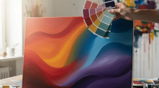
How to Use Color Theory to Intentionally Evoke Specific Emotions
Contrary to popular belief, evoking emotion isn’t about knowing “red means passion.” True emotional control comes from mastering the physics and psychology of color relationships. This guide deconstructs how adjacent colors, limited palettes, light, and even pigment quality are the…
Read more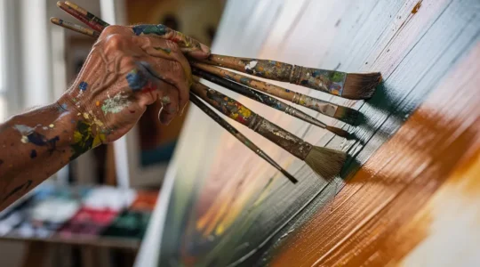
How to Develop a Unique Brushwork Signature That Collectors Recognize?
The solution to a generic painting style isn’t found in buying more brushes, but in mastering the intentional, physical rhythm of your mark-making. Expressive brushwork creates a direct emotional connection with the viewer through a process called kinesthetic empathy. Developing…
Read more
Oil, Acrylic, or Watercolor: Which Medium Suits Your Personality?
The right paint for you goes beyond technical properties; it’s about finding a creative partner that matches your personal workflow and lifestyle. Oils offer slow-drying forgiveness for patient, methodical painters but require specific safety and layering knowledge. Acrylics provide fast-drying…
Read more
Self-Taught vs. Art School: Which Path Truly Builds Technical Skill?
The best path to technical mastery isn’t about a degree versus no degree; it’s about choosing the learning system that matches your cognitive style. Art school provides an external, structured framework but often comes with immense debt and methodological rigidity….
Read more
How Can Ink Wash Painting Become Your Daily Meditation?
Contrary to belief, the goal of meditative ink wash painting is not to create a beautiful image, but to generate a physical record of a calm and focused mind. The materials—paper, brush, and ink—act as biofeedback instruments, revealing your inner…
Read more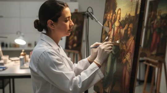
How Do Restorers Clean Centuries of Grime Without Removing Paint?
Contrary to the simple image of wiping away dirt, professional art restoration is a rigorous discipline of applied materials science. The process is not about “cleaning” but about executing precise, reversible chemical interventions. Success hinges on a deep analysis of…
Read more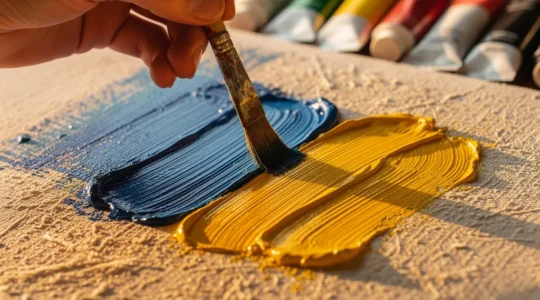
How to Use Impressionist “Broken Color” to Make Your Modern Paintings Vibrate with Light
The secret to Impressionist luminosity isn’t the paint you use, but understanding how the human eye perceives it. Instead of physically blending on the canvas (which creates mud), “broken color” uses distinct strokes that mix optically in the viewer’s eye,…
Read more
How to Distinguish True Craftsmanship From Mass Production in Art Objects?
True artistic value is not found in a brand name, but in a hierarchy of intentional, technical choices that mass production cannot replicate. Inferior materials and finishes lead to exponential restoration costs and value loss, betraying a lack of long-term…
Read more