The price difference between artist paints is not a marketing trick; it’s a direct measure of the paint’s chemical stability and the purity of its ingredients.
- Cheap paints are bulked out with “fillers” that compromise color vibrancy, cause cracking, and make mixing unpredictable.
- Professional paints use a high pigment load of lightfast materials, ensuring your colors remain true for decades, not just years.
Recommendation: Choosing professional-grade paint is an investment in your work’s permanence and predictability. The higher upfront cost prevents much larger future costs in restoration and material waste.
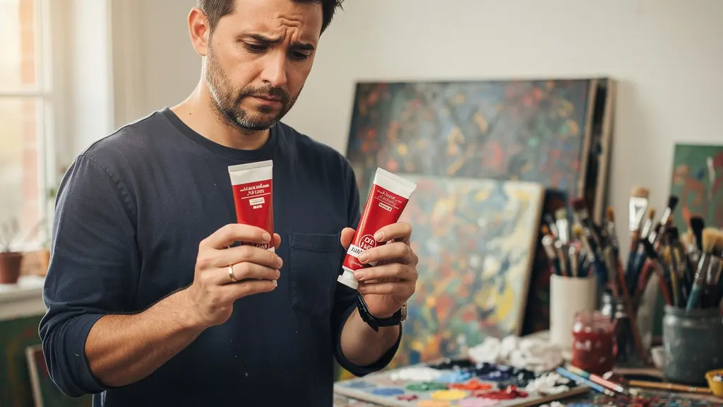
Every artist has faced the wall of color at the art supply store, a moment of decision between a $5 tube of “Cadmium Red Hue” and a $40 tube of genuine Cadmium Red. The common wisdom whispers that the expensive tube simply has “more pigment.” While true, this is a dangerous oversimplification. It ignores the fundamental industrial chemistry that dictates not just the initial brilliance of a color, but its behavior over time, its interaction with other paints, and its very survival on the canvas.
The real story isn’t about what’s added to professional paints, but what they are meticulously engineered *without*. Cheap paints are not just diluted versions of their professional counterparts; they are entirely different chemical formulations. They are packed with extenders and fillers—like chalk and talc—that actively interfere with the paint’s structure. This isn’t a simple matter of saving money; it’s a trade-off that introduces an unknown and unpredictable variable into your creative process.
But if the real distinction lies in the unseen chemical architecture, how can an artist make an informed choice? The key is to stop thinking like a consumer and start thinking like a chemist. This means looking past the price tag and understanding the long-term liability you are either accepting or rejecting with each tube. This article will deconstruct the manufacturing realities of artist paint, exposing the compromises hidden within that $5 tube.
We will dissect the role of fillers, quantify the impact of low pigment density on your color mixing, identify the fugitive pigments doomed to fade, and decode the “Hue” trap on paint labels. By understanding the material science, you’re not just buying paint; you’re investing in the archival integrity of your work.
This guide breaks down the essential chemical and practical differences between paint grades to empower your purchasing decisions. Explore the table of contents below to navigate the core components that determine a paint’s true cost and value.
Contents: Decoding the True Cost of Artist Paint
- Fillers vs. Pigment: What Are You Actually Paying For in Cheap Paint?
- How Low Pigment Density Ruins Your Color Mixing Results?
- Fugitive Colors: Which Pigments Will Fade From Your Canvas in 10 Years?
- The “Hue” Trap: When Is a Color Name Not the Real Pigment?
- When Do Major Art Supply Brands Discount Their Series 5 Pigments?
- Why Must All Modern Restoration Techniques Be Fully Reversible?
- Why Cheap Materials in Modern Art Will Cost You Double in Restoration?
- Oil, Acrylic, or Watercolor: Which Medium Suits Your Personality?
Fillers vs. Pigment: What Are You Actually Paying For in Cheap Paint?
From a manufacturing standpoint, the core difference between a $5 tube and a $40 tube is not just the quantity of pigment, but the presence of industrial fillers and extenders. In professional-grade paint, the formula is simple: a high concentration of pure pigment suspended in a quality binder (like linseed oil or acrylic polymer). In student-grade paint, a significant portion of the pigment is replaced by bulking agents to reduce cost. These are not inert powders; they are active chemical components that fundamentally alter the paint’s properties.
Fillers like calcium carbonate (chalk), barium sulfate, and talc are added to give the cheap paint tube weight and a deceptively buttery consistency. However, they are chemically distinct from the pigment particles. They have different particle sizes and refractive indexes, which means they scatter light differently. The immediate result is a less saturated, chalky color when mixed. Over the long term, these additives can cause serious structural problems. Aluminum stearate, for example, can make an oil paint film brittle and prone to cracking as it ages.
Therefore, when you buy cheap paint, you are paying primarily for fillers and a minimal amount of actual colorant. The low price reflects the low cost of these bulk materials. The high price of professional paint reflects the cost of sourcing, milling, and formulating with pure, high-performance pigments, ensuring what’s in the tube is almost entirely color and binder.
The following table breaks down common fillers and their specific, often detrimental, effects on your paint’s quality and longevity. As this analysis of paint composition shows, these additives are the primary source of long-term material failure.
| Filler Type | Common Usage | Effect on Paint Quality |
|---|---|---|
| Aluminum Stearate | Budget paints | Adds buttery feel but causes brittleness over time |
| Barium Sulfate | Student-grade | Adds weight and transparency but weakens tinting strength |
| Calcium Carbonate (chalk) | Cheap paints | Causes desaturation and chalky appearance in mixes |
| Talc | Low-end products | Reduces color vibrancy and durability |
How Low Pigment Density Ruins Your Color Mixing Results?
The high concentration of fillers in cheap paint leads directly to a critical performance failure: low tinting strength. Tinting strength refers to a color’s ability to change the hue of another color. A paint with high tinting strength is pigment-dense; a tiny amount can dramatically alter a large amount of white paint. Conversely, a paint with low tinting strength is filler-heavy and requires a much larger volume to achieve the same effect.
This isn’t just an inconvenience; it fundamentally contaminates your color space. When you attempt to mix a vibrant secondary color, like a clean orange from red and yellow, the fillers from both cheap paints will be present in the final mixture. These extenders, often a chalky white or grey, desaturate the mix, resulting in a muddy, dull orange instead of a brilliant one. You are not just mixing pigments; you are mixing pigments diluted with inert powders that degrade the final result.
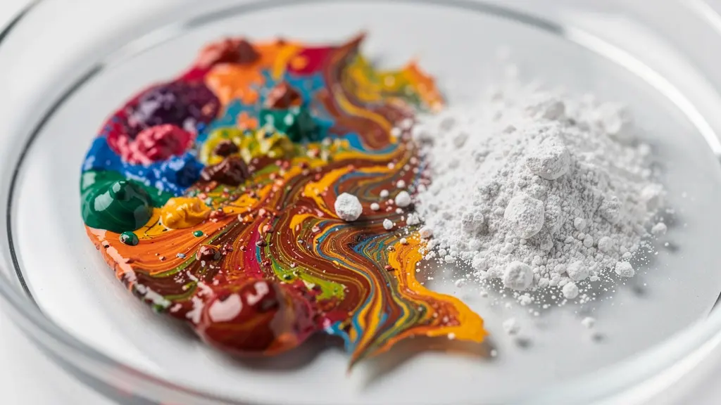
As the image above illustrates, the interaction between pure pigments results in clear, vibrant new colors. When fillers are introduced, the mixture becomes cloudy and desaturated at a microscopic level. This forces the artist to use more and more paint to try and overcome the weakness, which only adds more filler to the mix, exacerbating the problem.
Case Study: The True Cost of Tinting Strength
An artist’s test documented by The Frugal Crafter provides a stark, quantitative example. To create the same light sky blue, it required 1 part of professional-grade Phthalo Blue mixed with 20 parts of white. To achieve the same color with a student-grade version, it took 1 part of the blue to only 4 parts of white. This means the artist had to use five times more student-grade paint to get the same result, ultimately making the “cheaper” paint far more expensive for the actual painting produced.
Fugitive Colors: Which Pigments Will Fade From Your Canvas in 10 Years?
Beyond fillers, the second major compromise in cheap paints is the use of fugitive pigments. These are colorants with poor lightfastness, meaning they chemically react and break down when exposed to ultraviolet light. A brilliant red can fade to a pale pink, and a deep violet can disappear into a murky grey. Professional paint manufacturers invest heavily in sourcing and milling permanent pigments that have been rigorously tested to withstand centuries of light exposure, often certified by the American Society for Testing and Materials (ASTM).
Cheaper paints often use pigments like Alizarin Crimson (NR9) instead of its permanent, modern replacement, Quinacridone Magenta (PV19). While they may look similar out of the tube, their chemical stability is worlds apart. The use of fugitive pigments is a ticking clock on your artwork. In fact, conservation specialists at Fine Art Restoration report that some fugitive pigments can lose 40-60% of their color intensity within just 10-15 years under typical gallery lighting. This is not a slow, graceful aging; it’s a catastrophic failure of the material.
For an artist, this means the color relationships and values carefully established during painting will warp and disappear over time, destroying the original intent of the work. Investing in paints with excellent or very good lightfastness ratings (typically ASTM I or II) is the single most important step an artist can take to ensure the longevity of their creations.
Your 5-Step Paint Palette Lightfastness Audit
- Inventory Your Tubes: List every color on your current palette. Look for the pigment information on the label (e.g., PR101, PB29). If it’s not listed, this is a major red flag for low quality.
- Check ASTM Ratings: For each tube, find the ASTM Lightfastness rating. It’s usually a roman numeral (I, II, III, IV, V). Prioritize using only I (Excellent) and II (Very Good).
- Identify Fugitive Pigments: Cross-reference your list against known fugitive pigments. Common culprits include genuine Alizarin Crimson (NR9), Rose Madder, and Gamboge.
- Find Permanent Replacements: For every fugitive pigment you identify, research its modern, lightfast replacement. For example, replace Alizarin Crimson with a Quinacridone or Perylene-based color.
- Create a Test Strip: For any questionable paints, create a test strip. Paint a swatch, cover half of it with opaque black tape, and leave it in a sunny window for several months. The difference will reveal the pigment’s stability.
The “Hue” Trap: When Is a Color Name Not the Real Pigment?
The word “Hue” on a paint tube is a critical piece of industrial code that many artists misunderstand. It does not mean “color.” It specifically means: “This paint is formulated to look like the expensive pigment named, but it does not contain that pigment.” For example, “Cadmium Red Hue” contains zero cadmium. “Cobalt Blue Hue” contains zero cobalt. These are approximations, or simulants, created by mixing cheaper, less expensive modern pigments.
As artist and educator Will Kemp explains, the composition of these hues is often a closely guarded secret. This presents a problem for the artist, as the mixing properties will not be the same as the genuine pigment. The hue might look similar out of the tube but behave unpredictably when mixed with other colors, often producing duller results than expected.
Cadmium Red Hue is not a single pigment, but often a proprietary blend of more affordable ones like Napthol Red and Arylide Yellow.
– Will Kemp, Will Kemp Art School
However, the “Hue” is not always just a budget compromise. In the case of heavy metal-based pigments like cadmiums and cobalts, which are toxic and require careful studio hygiene, the hue alternatives offer a significant advantage. Modern organic pigments used to create these hues are often non-toxic, making them a safer choice for artists working in home studios, especially those with children or pets. This reframes the choice as one of conscious risk management rather than simply cost.
Case Study: A Health and Safety Perspective on “Hue”
An analysis by Jackson’s Art highlights that while genuine cadmium and cobalt pigments pose health risks if mishandled (ingestion or inhalation of dust), the modern “hue” alternatives are typically non-toxic. This has led many artists to intentionally choose hues not for price, but for safety. In this context, the “Hue” label becomes a valuable indicator for artists prioritizing a non-toxic workspace, turning a perceived negative into a practical positive.
When Do Major Art Supply Brands Discount Their Series 5 Pigments?
The “Series” number on a tube of professional paint (from Series 1 up to Series 9 in some brands) is a direct indicator of the cost of the raw pigment inside. Series 1 paints are typically made from inexpensive, stable earth pigments like iron oxides (e.g., Burnt Sienna). Higher series numbers, like 5 and above, are reserved for paints made from rare, difficult-to-process, or volatilely priced raw materials. The most famous examples are the cobalts and cadmiums.
The price of these pigments is not set by the paint manufacturer, but by global commodity markets. Cobalt, for instance, is heavily mined in the Democratic Republic of Congo, and its price is subject to geopolitical instability. In fact, a Natural Pigments market analysis shows that cobalt pigment prices fluctuated by as much as 300% between 2016 and 2018 due to this instability. This volatility is passed directly to the artist. The high price of a tube of genuine Cobalt Blue is not brand markup; it’s a reflection of the extreme cost and risk of securing the raw material.
Because these prices are tied to raw material costs, high-series pigments are rarely discounted on an individual basis. It is simply not profitable for retailers. Artists looking for savings on these premium colors must be more strategic:
- Wait for store-wide sales: Major holiday sales (typically 20-25% off everything) are the best opportunity, as they apply even to high-series paints.
- Buy in sets: Many brands offer sets where the overall cost is averaged across tubes, effectively discounting the more expensive colors.
- Track commodity markets: For the truly dedicated, monitoring the price of raw cobalt and cadmium can help predict paint price hikes 3-6 months in the future.
- Leverage promotions: Take advantage of “buy X, get a Series 1 free” deals to offset the cost of a high-series purchase with a free, essential earth color.
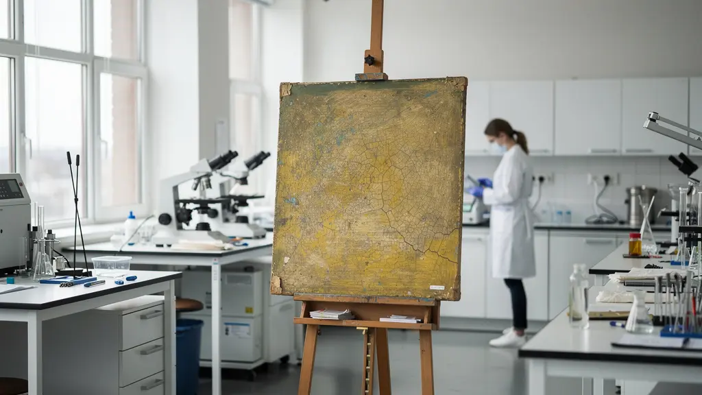
Why Must All Modern Restoration Techniques Be Fully Reversible?
In the world of art conservation, the prime directive is reversibility. This principle dictates that any treatment applied to a work of art—be it a layer of varnish, a touch-up of paint, or a structural repair—must be able to be safely undone in the future without damaging the original artwork. This is because conservation science is constantly evolving; a technique considered state-of-the-art today may be found to be damaging in 50 years. Reversibility allows future conservators to remove today’s work and apply their own, more advanced methods.
This principle is directly threatened by the use of cheap, low-grade art materials. Professional paints are made with known, well-documented pigments and binders. A conservator can analyze a professional painting and, knowing it contains genuine Ultramarine (PB29) in linseed oil, select a specific solvent that will safely remove an old, yellowed varnish without affecting the paint layer. This predictability is the foundation of safe conservation.
Cheap paint, with its secret cocktail of fillers, extenders, and unknown pigment blends, destroys this predictability. The paint film is a chemical wild card. A solvent that is safe for one pigment might dissolve a filler or a cheap modern binder in the same paint layer, causing irreversible damage. The choice of materials by the artist directly dictates the future viability of their work for conservation.
A conservator working on a painting made with high-quality, known pigments can use specific, tested solvents. A painting with cheap paint contains unknown fillers and binders, making solvent choice a dangerous gamble.
– Fine Art Restoration UK, Professional Painting Assessment Guide
Key Takeaways
- The true enemy of quality is not low pigment, but the presence of active fillers that degrade color and structure.
- The “Hue” label isn’t just a budget indicator; it can be a conscious choice for a safer, non-toxic studio environment.
- The initial “saving” on cheap paint is often a down payment on vastly more expensive future restoration costs or total material failure.
Why Cheap Materials in Modern Art Will Cost You Double in Restoration?
Choosing cheap art supplies is not a saving; it’s a deferral of cost. The initial low price of student-grade materials is a down payment on the much higher future expenses required to fight their inevitable decay. The brittleness caused by fillers leads to cracking and flaking, a process known as delamination. The use of fugitive pigments necessitates extensive inpainting by a conservator to restore faded colors. The unknown binders and additives can cause varnishes to yellow unevenly or become impossible to remove safely.
Each of these failures requires a highly skilled and expensive intervention from a professional art conservator. The cost of their time, expertise, and specialized materials to repair a single painting can easily dwarf the entire lifetime art supply budget of the original artist. An analogy from the world of commercial painting provides a clear financial model: a decade-long study by Beach Painting Contractors reveals that using cheap paint for a job required more frequent repainting, making it significantly more expensive over the long term than using a premium product from the start. The principle is identical for fine art: short-term savings lead to long-term financial burdens.
The table below, based on data from conservation specialists, starkly illustrates the potential 50-year cost difference. A painting made with quality materials may require only minor cleaning, while one made with cheap materials becomes a recurring and expensive restoration project.
| Restoration Type | Student-Grade Materials Cost | Artist-Grade Materials Cost |
|---|---|---|
| Inpainting faded colors | $3,500-5,000 | $500-1,000 |
| Consolidating cracking paint film | $4,000-6,000 | $0 (not needed) |
| Removing yellowed varnish | $2,500-4,000 | $800-1,200 |
| Structural repairs from delamination | $5,000-8,000 | $0 (rare with quality materials) |
| Total 50-year restoration | $15,000-23,000 | $1,300-2,200 |
Oil, Acrylic, or Watercolor: Which Medium Suits Your Personality?
Ultimately, the choice between student and professional-grade paint transcends mere budget and ventures into the realm of process and personality. The physical experience of using the paint—its texture, its smell, its response to the brush—is an integral part of the creative act. Different mediums and quality grades offer distinct sensory feedback that can either align with or fight against an artist’s personal temperament.
Oil painters who revel in slow, deliberate blending and the rich, buttery feel of paint may find professional, pigment-dense oils to be a necessity. Cheap oils, often feeling “gritty” from fillers or overly “slippery” from excess oil, cannot replicate this tactile pleasure. As professional artist Sophie Ploeg noted in her experience with premium Rublev Colours oils, for some artists whose process is deeply sensory, the physical experience itself justifies the cost.
Conversely, an artist whose personality is quick, impatient, and experimental might be frustrated by the slow drying time of oils. They might gravitate towards acrylics. Yet here, too, quality matters. As experts at Jackson’s Art note, low-quality acrylics can have inconsistent drying times and a dramatic color shift, darkening significantly as their high water and filler content evaporates. This can be infuriating for an artist who relies on quick, accurate color decisions. A professional acrylic, with its higher pigment load and minimal color shift, provides the predictability this personality type needs to work effectively.
The question is not simply about what medium you use, but how the quality of that medium supports your unique creative workflow. It’s about matching the material’s behavior to your own. A patient, methodical painter might feel at home with premium oils, while a spontaneous, fast-working artist might require the reliability of professional acrylics to keep up with their ideas.
The next time you stand before that wall of color, the question should not be, “Can I afford the $40 tube?” but rather, “Can my artwork afford the chemical compromises and future liabilities of the $5 tube?” Evaluate your artistic goals, read the labels for pigment information, and make a conscious investment in the permanence and predictability of your work.